Want your kitchen to look new again without paying for a full cabinet replacement?
For many Melbourne homeowners, painting the existing cabinets is the smarter project. The layout already works, the room stays functional, and the budget goes much further than it does with new joinery. The primary decision is not whether paint is cheaper than a renovation. It is whether your current doors, panels, and frames are in good enough condition to justify a proper finish.
From my side as a project manager at Newline Painting, the result comes down to preparation more than colour choice. Grease removal, sanding, adhesion primer, repairs to swollen edges, and the right topcoat all affect how the finish holds up around heat, steam, and daily wear. A cabinet job can look sharp on day one and still fail early if the prep is rushed or the substrate is poor.
That is why these ideas focus on more than style. Each one needs a different level of prep, a different sheen strategy, and a different expectation for maintenance, especially in busy family kitchens and older Melbourne homes. If you are weighing colour options and what a professional process involves, our guide to painting kitchen cupboards covers the practical side in more detail.
Some finishes suit compact apartments. Others sit better in Victorian, Federation, or newer open-plan homes. Some are ideal for pre-sale work where broad appeal matters. Others are better for long-term living, where durability and touch-up practicality count just as much as appearance. If you want extra inspiration beyond painting, these ways to update your kitchen cabinets are also worth a look.
Table of Contents
- 1. Classic White and Cream Cabinets
- 2. Deep Navy and Charcoal Modern Cabinets
- 3. Two-Tone Cabinet Combinations
- 4. Natural Wood and Stain Finishes
- 5. Matte Black Modern Industrial
- 6. Soft Sage Green and Muted Earth Tones
- 7. High-Gloss and Semi-Gloss Contemporary Finishes
- 8. Handleless Minimalist Cabinets with Soft-Close Hardware
- 9. Blackboard and Chalkboard Paint Features
- 10. Mixed Material and Texture Cabinets Paint plus Timber plus Rattan
- 10 Kitchen Cabinet Painting Ideas Comparison
- Ready to Transform Your Kitchen?
1. Classic White and Cream Cabinets
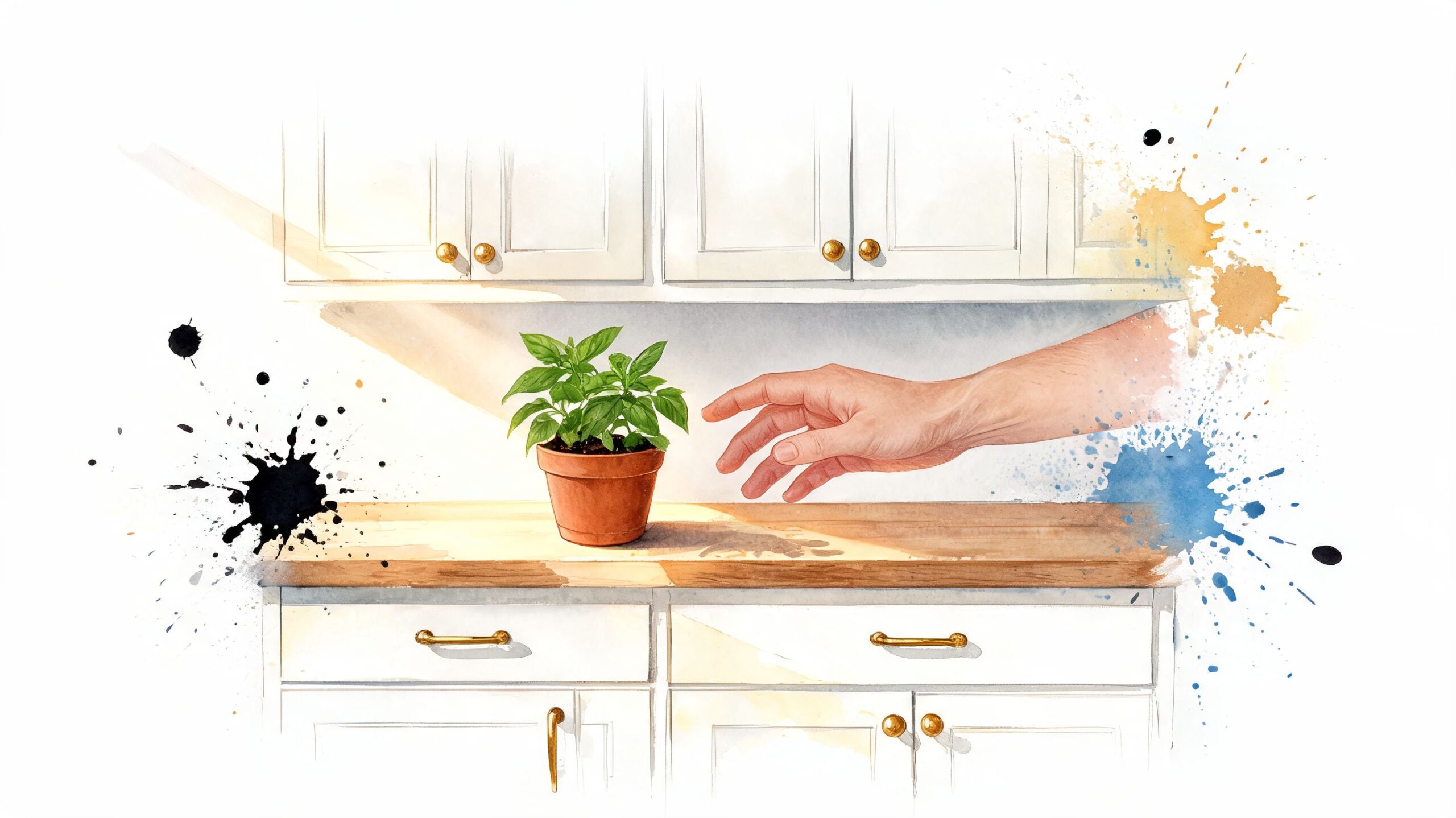
Want a kitchen update that still looks right five or ten years from now? White and cream cabinets are usually the safest place to start, especially in Melbourne homes where natural light, older timber floors, and mixed interior styles all need to work together.
These colours keep a kitchen bright and readable. They suit shaker doors, flat profiles, and older routed fronts without fighting the rest of the room. In smaller apartments and period homes, they also help the space feel cleaner and less closed in.
The trade-off is simple. White shows grease, hand marks, and chips sooner than mid-tone colours. Cream is more forgiving, but the wrong cream can turn yellow against cool splashbacks or stone.
Why it keeps working
We still see white and cream chosen regularly for repaints because they give the biggest visual change without changing the kitchen layout. They also make resale preparation easier. Buyers can place their own stools, pendants, and hardware choices around a neutral cabinet colour far more easily than around a bold finish.
Shade selection matters more than many homeowners expect. A crisp white can look sharp in a newer townhouse with cooler stone and black tapware. In a Californian bungalow or older brick home, a soft white or light cream usually sits better with warm flooring and existing trims. If the room feels awkward or dark, it helps to start with a proper plan for choosing paint colours that improve a room's appearance.
For most cabinet repaint projects, satin or semi-gloss is the practical choice. Flat paint marks too easily in a working kitchen. Full gloss can look great, but it highlights surface defects, old grain patterns, and patchy filler work.
Practical rule: Pair white or cream cabinets with warmer benchtops, brushed brass, or soft black hardware so the kitchen does not feel washed out.
Prep decides whether this finish lasts. Doors and panels need a full degrease, sanding to remove weak coatings, filler where needed, and a primer matched to laminate, timber, or MDF. After that, the topcoat has to be applied evenly and cured properly. On a professional job, that process adds labour cost, but it usually saves money compared with repainting again after peeling, chipping, or poor adhesion.
As a rough guide, classic white and cream usually sit in the mid-range for cabinet repaint pricing. They do not cost more because of the colour itself. The condition of the doors, the amount of repair work, and whether the finish is brushed or sprayed usually drive the quote. For most Melbourne homes, durability is strong when the prep is done properly. I would rate it around 8/10 for long-term performance in a busy family kitchen.
When homeowners ask whether they should DIY or bring in a specialist, finish quality is usually the deciding factor. Cabinet doors need controlled drying, clean handling, and consistent application to avoid runs, dust nibs, and visible brush marks. If you're comparing options, our guide to painting kitchen cupboards explains what a professional process should include.
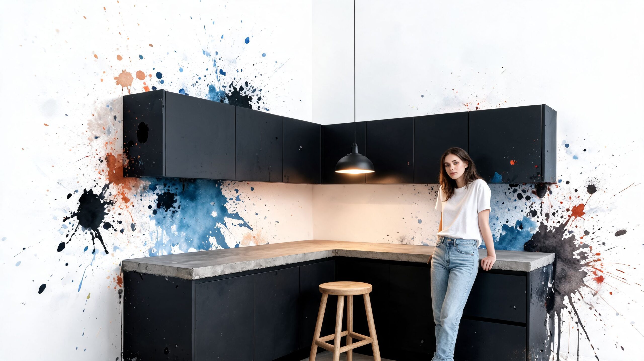
2. Deep Navy and Charcoal Modern Cabinets
Want a kitchen that feels sharper and more architectural without replacing the cabinets? Deep navy and charcoal can do that, but only if the room has enough light and the finish is clean. In many Melbourne homes, these colours suit newer builds, renovated terraces, and apartments where the cabinetry needs more presence.
They also bring a clear trade-off. Dark colours add depth, but they show poor workmanship faster than lighter shades. Scratches, sanding marks, filler patches, dust in the topcoat, and uneven sheen all stand out once the light hits the doors.
That is why preparation carries more weight here than the colour choice itself. On navy or charcoal cabinets, I want a full degrease, a careful sand, proper filling, and a primer matched to the substrate, whether that is laminate, MDF, or timber. Spray application usually gives the best result for this look because it keeps the finish flatter and more uniform. Brushing can work on some jobs, but dark colours are less forgiving of lap marks and texture.
A practical colour check helps before committing. Look at the room in the morning, late afternoon, and at night with the existing lighting switched on. If the kitchen already feels flat or underlit, dark base cabinets with lighter uppers often hold up better than taking every door and panel to charcoal. This guide on how to pick paint colours and use paint to fix a room's appearance is a useful starting point if the room proportions or lighting are working against you.
Cost usually lands slightly above a straightforward light-colour repaint, not because navy or charcoal paint is expensive by nature, but because these colours tend to demand tighter prep and cleaner application. In a professional repaint, I would generally rate durability around 8/10 when the substrate is sound and the coating system is suited to cabinetry. The finish lasts well, but only if doors are cured properly and treated with care during reassembly.
For styling, navy works well with warm whites, marble-look tops, and brass or aged bronze hardware. Charcoal pairs better with cooler stone, black fittings, or pale timber accents. The goal is balance. If every surface is dark, the kitchen can start to feel smaller than it is.
3. Two-Tone Cabinet Combinations
Want a kitchen that feels more custom without committing every cabinet to one colour? Two-tone cabinetry is one of the most reliable ways to get contrast, depth, and a better sense of proportion, especially in Melbourne homes where kitchens often need to work with limited natural light or older room layouts.
The best version of this look is planned, not improvised. In practice, that usually means lighter overhead cabinets to keep the room open, a darker or warmer colour on the base cabinets to add structure, and one connecting element that stops the scheme from feeling split in half. Benchtops, handles, splashbacks, and flooring all do that job.
Where two-tone works best
Two-tone combinations suit kitchens that need visual balance more than drama. I recommend them most often where there is a long run of cabinetry, a compact footprint, or ceiling height that makes full-height cupboards feel heavy. The contrast breaks up the mass of joinery and gives the eye a place to rest.
They also solve a common problem. Homeowners often like the idea of colour, but a full kitchen in navy, green, or charcoal can feel too dominant once the doors are back on and the room is in daily use. Keeping the stronger colour below bench height is the safer decision. It anchors the room and does a better job of hiding scuffs, shoe marks, and general wear around kickers and lower doors.
The trade-off is labour. Two colours mean more sorting, more masking, and tighter control during spraying and reassembly. If the line between upper and lower cabinets runs through tall pantry units or side panels, the layout needs to be resolved before any prep starts. A rushed painter can make a good colour scheme look indecisive.
A pairing method that works on site:
- Keep uppers light: White, warm white, cream, and pale greige usually hold up best overhead.
- Use depth below: Navy, muted green, charcoal, and earthy mid-tones carry the lower half well.
- Repeat one finish elsewhere: Hardware, stools, shelving, or a splashback should connect the two colours.
- Match the sheen: Different gloss levels often look like a mistake rather than a design choice.
Darker lower cabinets usually age better in busy kitchens because they hide everyday wear more effectively than dark uppers.
For preparation, two-tone jobs need the same cabinet-standard cleaning, sanding, and priming as any quality repaint, but colour placement adds another layer of decision-making. We check how the split works against appliance panels, end panels, and bulkheads before final colour approval. That step prevents awkward transitions that are expensive to correct later.
In cost terms, a two-tone professional repaint usually sits above a single-colour cabinet repaint because setup and handling take longer. For Melbourne kitchens, I would generally treat this as a mid-to-upper range cabinet painting option rather than a budget one. Durability is still strong, around 8/10, provided the prep is thorough and the coating system is suited to doors, drawers, and high-touch areas.
The finish works best when the contrast looks deliberate. White uppers with olive or navy lowers suit many period and transitional homes. Warmer neutrals over muted timber-look floors often feel more settled than sharp black-and-white combinations in older Melbourne kitchens.
4. Natural Wood and Stain Finishes
Not every kitchen should be painted. If the cabinets are solid timber, the door profile suits the home, and the grain is attractive, refinishing in stain can be the better move. This is especially true in heritage homes, farmhouse-style kitchens, and family homes where a painted finish might feel too slick or too trendy.
Natural-looking timber tones work best when they move away from heavy orange or red finishes and toward softer oak, walnut, or muted brown tones. The goal is warmth, not nostalgia for a dated clear lacquer.
When stain is better than paint
Stain is often less forgiving than expected. If you're lightening timber, the existing finish usually has to come right back. If the cabinets are veneer rather than solid wood, aggressive sanding can cause more problems than it solves. That's why the first decision isn't colour. It's whether the substrate can be refinished safely.
For occupied homes, timber refinishing can also be messier than cabinet painting. Dust control, extraction, and dry time matter. Kitchens need to stay functional, and homeowners often underestimate how much site protection is needed to keep adjacent rooms clean.
Use stain when:
- The timber is worth showing: Good grain and sound joinery make refinishing worthwhile.
- The door style suits the house: Shaker or simple panel profiles usually adapt better than ornate dated profiles.
- You want warmth over contrast: Timber works well with stone, linen, and softer wall colours.
If the timber is patchy, damaged, or visually fighting the rest of the kitchen, paint is often the cleaner answer.
5. Matte Black Modern Industrial
Matte black can look excellent in inner-city apartments, industrial conversions, and newer minimalist homes. It pairs naturally with concrete-look benchtops, stainless appliances, smoked glass, and pale timber shelving. It also hides some everyday scuffs better than bright white.
But black cabinets narrow your margin for error. The room needs enough lighting, and the surrounding materials need some warmth. Without that balance, black can feel severe rather than refined.
What can go wrong
The most common problem isn't the colour itself. It's that homeowners use black on every surface and end up flattening the room. Cabinets, handles, splashback, stools, and pendants all disappear into one dark block.
The second problem is finish inconsistency. Matte black needs even coverage and consistent curing, or you'll notice patchiness on large door faces. Kitchens also need practical washability, so the paint system has to be chosen carefully. Matte in appearance doesn't mean fragile, but not every product marketed as matte is suitable for heavy-contact cabinetry.
A black kitchen needs contrast somewhere. Timber, stone veining, brushed metal, or a lighter wall colour usually provides it.
Where this idea works well, it feels deliberate and architectural. Where it doesn't, it tends to feel like a fashion choice that dated quickly.
6. Soft Sage Green and Muted Earth Tones
Soft sage, mushroom, dusty olive, clay, and similar muted tones suit a lot of Melbourne kitchens because they add warmth without taking over the room. They work especially well in period homes, weatherboards, and renovated family kitchens where white can feel too stark and darker colours feel too heavy.
I recommend these colours for homeowners who want a kitchen to feel settled rather than trend-driven. They sit comfortably beside timber floors, aged brass, natural stone, and older brickwork. In south-facing kitchens, they can also read softer and more forgiving than cool greys.
Why they work in practice
These shades are flexible, but they are not foolproof. Sage can turn flat if the room has weak natural light. Mushroom can look muddy next to the wrong benchtop. Clay tones need enough contrast through splashbacks, handles, or wall colour, or the whole kitchen can start to blur together.
Lighting matters more than many homeowners expect. Before locking in a cabinet colour, check how it reads in morning light, late afternoon light, and under your task lighting. Good colour sampling and versatile lighting for home renovations both make a noticeable difference with these softer tones.
Preparation still decides how long the job lasts. In Melbourne kitchens, I pay close attention to grease removal around handles and cooking zones, moisture exposure near sinks and dishwashers, and cure times during colder months. Muted colours hide less surface inconsistency than people assume. If the substrate is patchy or the primer is wrong, the finish can look dull rather than calm.
For a professional result, the process usually includes:
- Large sample boards in the actual room: Small paint swatches rarely show the full undertone.
- Thorough degreasing and sanding: Earthy colours need a clean, even base to stay consistent across doors and panels.
- The right primer for the cabinet material: Laminate, melamine, and timber all behave differently.
- A washable cabinet-grade topcoat: Softer colours still need to handle fingerprints, food splashes, and regular cleaning.
If you're comparing products, this guide to choosing the right paint for kitchen cabinets is a useful place to start.
From a project management point of view, this colour family usually sits in the mid-range for cost. There is no premium pigment issue like some deep blues or reds, but the finish still depends on careful prep and controlled application. Durability is generally strong, around 7.5 to 8.5 out of 10, if the cabinets are cleaned properly, primed to suit the substrate, and given full curing time before heavy use.
7. High-Gloss and Semi-Gloss Contemporary Finishes
Want a kitchen that looks sharper the moment light hits the doors? Sheen does that work fast. It also exposes every shortcut.
High-gloss and semi-gloss both suit contemporary kitchens, but they behave very differently on real cabinetry. High-gloss gives the strongest reflection and the most polished look. Semi-gloss still feels clean and modern, but it is easier to live with in busy Melbourne homes because it shows fewer surface defects, fewer fingerprints, and less day-to-day wear.
From a project manager's point of view, this finish category is less about colour choice and more about substrate quality, application method, and expectations. Gloss magnifies filler edges, sanding scratches, chipped corners, swollen MDF, and old brush marks. If the cabinet fronts are tired, the prep bill rises quickly.
Which finish makes sense in practice
I usually recommend semi-gloss for family kitchens, investment properties, and older cabinet sets being refinished on site. It gives good washability and a crisp look without putting every imperfection on display. High-gloss works best where the doors are in excellent condition, the profile is simple, and the client wants a more architectural result.
A professional-spec process for this type of finish usually includes careful degreasing, thorough sanding, spot repairs, substrate-appropriate primer, and spray application in controlled conditions. Brushing and rolling can work on some cabinet jobs, but they rarely deliver the same consistency on reflective finishes. If you're comparing products and sheen levels, this guide on choosing the right paint is a useful starting point.
Lighting has a bigger role here than many homeowners expect. Gloss surfaces bounce light around the room, which can help a compact kitchen feel larger, but poor lighting can make reflections look harsh rather than intentional. This article on versatile lighting for home renovations is worth reviewing if you're planning cabinetry, splashbacks, and lighting together.
In cost terms, semi-gloss usually sits in the mid to upper-mid range. High-gloss often lands higher because the prep standard has to be tighter and the finish is less forgiving during application. For durability, semi-gloss generally rates around 8/10 in a well-used kitchen. High-gloss can perform just as well, but only if the surface underneath is properly repaired and the coating system is allowed to cure fully before heavy use.
A useful reference point for the finish itself is below.
8. Handleless Minimalist Cabinets with Soft-Close Hardware
This idea sits half in paint and half in joinery. A handleless look can make an older kitchen feel more architectural, but only if the cabinet layout and hardware details are thought through before painting starts.
The visual effect comes from uninterrupted lines. Flat-panel doors, consistent colour, restrained sheen, and minimal visual clutter do most of the work. Soft-close hardware supports the feeling of a more refined kitchen, even though it isn't a paint feature on its own.
Plan the hardware before the paint
Many projects falter due to improper sequencing. People paint first, then decide to fill old handle holes, shift pull positions, or retrofit new mechanisms. That almost always creates extra patching, repeat sanding, and touch-ups that weaken the final finish.
For a clean handleless look, decide early whether you're using:
- Finger pulls or rail profiles: Best when integrated neatly and planned from the start.
- Push-to-open hardware: Good visually, but it needs accurate adjustment and suitable door alignment.
- Minimal visible pulls: Often the most practical compromise in busy family kitchens.
The colour choice can stay simple here. Whites, warm greiges, deep charcoals, and muted greens all work well because the focus is the line of the cabinetry, not decorative detail. In occupied homes, this type of update often benefits from coordinated project management, especially if painters and cabinet hardware installers need to work in sequence.
9. Blackboard and Chalkboard Paint Features
A full kitchen of chalkboard-finish cabinets usually sounds better than it looks. Used selectively, though, it can be smart. One pantry panel, the side of an island, or a small run of lower cabinetry can add personality without making the whole kitchen feel novelty-driven.
This idea tends to suit family homes, casual kitchens, and spaces where notes, shopping lists, or kids' drawings are part of daily life. It's less suited to formal kitchens or homes being styled for broad resale appeal.
Keep it as an accent
The mistake is using chalkboard paint where constant touching and scrubbing happen. That finish is better on lower-contact surfaces or feature sections, not the main cabinet doors around the sink and cooktop.
A stronger result usually comes from pairing one chalkboard section with a more stable cabinet colour such as white, mushroom, sage, or charcoal. That keeps the feature intentional. It also makes future repainting easier if your tastes change.
Use chalkboard paint where interaction is the point. Don't use it where grease, steam, and constant cleaning are the main conditions.
Maintenance also needs a realistic conversation. Chalk dust, wiping patterns, and ghosting can bother some homeowners. For others, that lived-in look is exactly the appeal.
10. Mixed Material and Texture Cabinets Paint plus Timber plus Rattan
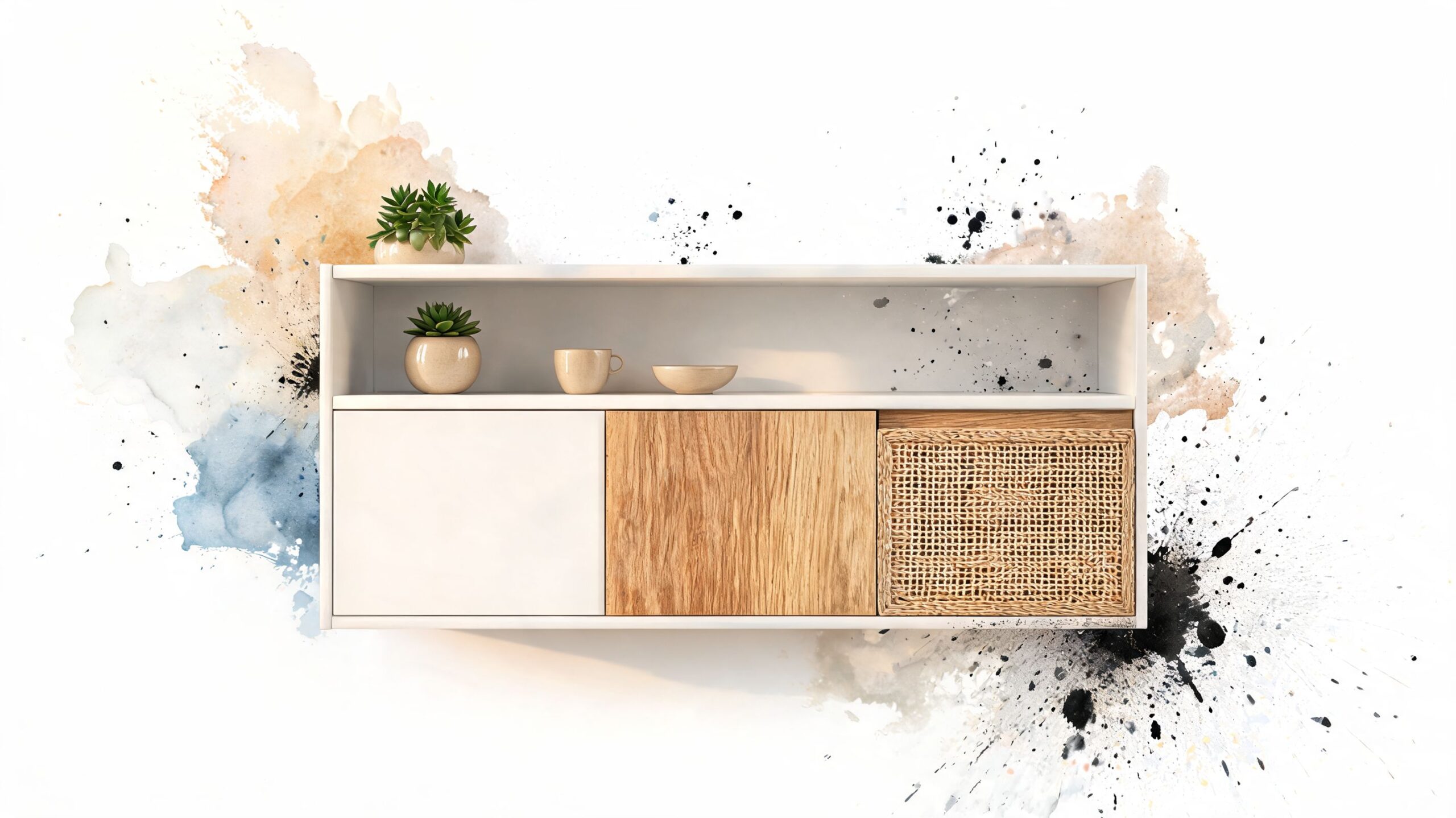
Want a kitchen with more warmth and character than a full painted finish can give? Mixing paint with timber or rattan can work well, but the result depends on restraint, good prep, and choosing the right material for the right surface.
In Melbourne homes, I usually recommend letting painted cabinetry do most of the heavy lifting. It gives the kitchen a consistent base, keeps colour matching simpler across larger runs, and makes future touch-ups far easier. Timber then adds warmth where you want it. Rattan works best as a light feature, not as the dominant finish.
The practical question is maintenance. Painted doors are the easiest to clean and repaint later. Timber needs a proper sealer or topcoat near sinks, kettles, and cooktops or it can dry out, mark, or absorb grime. Rattan is the highest-maintenance option of the three because it catches dust, does not like hard scrubbing, and can look tired faster in busy family kitchens.
Keep the mix controlled
The best layouts keep texture in one or two clear areas. A painted kitchen with a timber island is a reliable option. Painted cabinetry with rattan inserts on a pantry door, buffet, or short run of uppers can also look considered and refined. Once you combine painted doors, exposed timber, open shelving, and woven panels across the whole room, the kitchen often starts to feel visually crowded.
That matters even more in average-sized Melbourne kitchens, where too many competing finishes can make the room feel tighter rather than richer.
For pre-sale work, I push clients toward simpler combinations. Buyers usually respond well to contrast and natural warmth, but they also look for a kitchen that appears easy to maintain. A clean paint-and-timber scheme tends to read as more practical than a design with several feature materials competing for attention.
These combinations usually hold up best:
- Paint plus oak: Warm, dependable, and easy to pair with stone, laminate, or tiled splashbacks.
- Paint plus rattan: Better on a feature panel, island back, or display cabinet than on high-use working doors.
- Paint plus open shelving: Works visually, but only suits households happy to keep shelves styled and dust-free.
From a project management point of view, mixed-finish kitchens need more coordination than a straight repaint. Painted sections still need degreasing, sanding, primer, and a durable cabinet-grade topcoat. Timber needs its own finishing system. Existing joinery also needs careful checking so the paint colour, timber tone, and sheen level sit well together rather than looking pieced together.
On durability, I'd generally rate painted cabinetry as high, sealed timber as medium to high, and rattan as medium in an active kitchen. Cost usually lands above a standard cabinet repaint because there is more masking, more product selection, and more labour in the finishing stages. In return, you get a kitchen with more depth and a custom feel, provided each material has a clear purpose.
10 Kitchen Cabinet Painting Ideas Comparison
| Style | Implementation Complexity 🔄 | Resource Requirements ⚡ | Expected Outcomes ⭐📊 | Ideal Use Cases 💡 | Key Advantages ⭐ |
|---|---|---|---|---|---|
| Classic White and Cream Cabinets | Low, straightforward repainting and prep | Mid-range cost; standard paints and hardware | Bright, versatile, broad buyer appeal; visually enlarges space | Small kitchens, pre-sale makeovers, mixed styles | Universally appealing, easy to coordinate |
| Deep Navy and Charcoal Modern Cabinets | Medium–High, needs even coverage and experienced painters | Mid–premium; premium paints, good lighting and primers | Dramatic, premium look that hides stains | High‑end renovations, modern apartments, well‑lit spaces | Strong designer impact; hides wear |
| Two‑Tone Cabinet Combinations | Medium, careful masking and line work required | Mid–premium; multiple paints, tape, skilled labour | Visual depth and zoning; contemporary, balanced look | Homeowners wanting a statement without full commitment | Flexible design, balances bold + neutral |
| Natural Wood and Stain Finishes | Medium, sanding and careful preparation required | Mid; quality stains and protective topcoats; best on solid wood | Warm, authentic grain-forward finish; timeless appeal | Heritage homes, farmhouse and timber cabinetry | Highlights craftsmanship; warm and enduring |
| Matte Black Modern Industrial | High, requires expert application for even matte finish | Premium; specialized matte paints and excellent lighting | Bold, contemporary, conceals marks but can darken space | Industrial/minimalist renovations, design‑led apartments | Strongly on‑trend; hides minor wear |
| Soft Sage Green & Muted Earth Tones | Medium, colour testing and lighting checks advised | Mid–premium; samples and quality paint | Warm, inviting, nature‑connected aesthetic | Transitional and heritage homes, eco‑conscious renovations | Distinctive yet sophisticated; complements natural materials |
| High‑Gloss & Semi‑Gloss Contemporary Finishes | High, flawless prep and multiple thin coats essential | Premium; high‑quality gloss paints and meticulous prep | Reflective, bright, very durable and easy to clean | Contemporary, high‑traffic family kitchens, display homes | Luxurious look; excellent durability and washability |
| Handleless Minimalist with Soft‑Close Hardware | High, cabinet modification and precise installation | Premium; soft‑close mechanisms, hardware and labour | Seamless, quiet operation and ultra‑clean lines | Ultra‑modern homes, show homes, design‑led projects | Minimal visual clutter; premium user experience |
| Blackboard / Chalkboard Paint Features | Low–Medium, limited area application recommended | Budget–mid; chalkboard paint and occasional maintenance | Interactive, family‑friendly accent; practical messaging area | Family kitchens, play zones, accent features | Affordable, distinctive and functional |
| Mixed Material & Texture Cabinets (Paint + Timber + Rattan) | Very High, complex coordination and custom work | Premium–high; multiple materials, custom fabrication | Layered, high‑end designer result with tactile interest | Luxury renovations, design‑conscious buyers, feature kitchens | Highly distinctive; blends organic and contemporary elements |
Ready to Transform Your Kitchen?
Choosing between these kitchen cabinet painting ideas comes down to three things. What suits the style of your home, what your existing cabinets can realistically support, and how long you want the finish to last. A colour can look excellent online and still be the wrong choice for your kitchen if the room is dark, the doors are heavily worn, or the prep requirements are being underestimated.
That's the part homeowners often don't see at the start. Cabinet painting is not wall painting. It involves degreasing, removing hardware, labelling doors, sanding correctly, filling where needed, priming for the exact substrate, controlling dust, and applying a system that can handle daily contact. On melamine, laminate, older enamel, or previously patched surfaces, the prep sequence matters more than the colour card.
In Melbourne homes, climate matters too. Kitchens deal with moisture, cooking grease, and frequent wiping. If the house has poor ventilation or the job is pushed through too fast in humid conditions, even a good-looking finish can start failing around edges and handles earlier than it should. That's why we take a no-nonsense approach at Newline Painting. We look at the actual substrate, the state of the doors, the use of the kitchen, and whether a sprayed finish, a brush-and-roll system, or a different update altogether is the smarter choice.
For homeowners comparing painting to replacement, there's also a straightforward value argument. Professional cabinet painting in a standard kitchen often falls well below the cost of new cabinetry, and in pre-sale situations a well-executed kitchen refresh can contribute to stronger presentation. The point isn't to promise miracles. It's to spend money where it changes what buyers or occupants see and use every day.
Some ideas on this list are safer and broader in appeal. White, cream, soft greige, and gentle earth tones usually sit comfortably in both owner-occupied and sale-focused projects. Others, like matte black, heavy texture mixing, or chalkboard sections, need more confidence and a clearer design plan. None of them work well if the prep is rushed.
If you're planning a kitchen refresh, it helps to assess the room as part of the whole house. Cabinet colour should connect with wall colours, flooring, splashback, hardware, lighting, and the level of wear the kitchen gets every week. That's often why clients ask us to review cabinetry alongside interior painting or pre-sale updates, rather than treating the kitchen in isolation.
If you'd like practical advice on what will work in your kitchen, contact Newline Painting for a free on-site quote and colour consultation. We service homes and apartments across Melbourne, provide clear written quotes, protect occupied homes carefully, and back our work with a 7-year workmanship warranty. The right cabinet finish doesn't come from guessing. It comes from good prep, suitable products, and a team that knows what will hold up once the kitchen goes back to real life.
If you're weighing up cabinet painting, pre-sale painting, or a broader interior refresh, Newline Painting can help you compare the practical options for your Melbourne home. We provide free on-site quotes, colour advice, clear scheduling, and properly scoped preparation so you know exactly what's involved before work starts.