You're usually looking at Lexicon paint colour after the obvious whites have failed. One sample looks too creamy in the afternoon. Another turns flat beside polished floorboards. Then a “safe” white suddenly reads cold in the back bedroom. That's a common Melbourne problem, especially in homes where light changes hard across the day and across the seasons.
Lexicon stays in the conversation because it gives a cleaner, sharper result than many soft whites, but it's not a colour you choose by name alone. In a Hawthorn Federation home, it can feel architectural and tidy. In a south-facing apartment, it can push much cooler than expected. The difference is rarely the fan deck. It's the light, the sheen, the surface preparation, and which Lexicon strength you're using.
Table of Contents
- Why Lexicon Is a Staple in Melbourne Homes
- The Anatomy of Lexicon Paint Colour
- How Lexicon Performs in Melbourne Lighting
- Lexicon Compared to Other Popular Whites
- Strategic Pairings and Interior Applications
- A Technical Guide to a Flawless Finish
- Ensuring a Perfect Lexicon Project in Melbourne
Why Lexicon Is a Staple in Melbourne Homes
Lexicon stays popular in Melbourne because it solves a specific brief. It gives you a white that feels modern and crisp without automatically drifting warm, muddy, or beige once it hits the wall.
That matters across very different housing stock. A Victorian terrace in Albert Park often needs a white that sharpens old plasterwork and decorative trim without making the front rooms feel dated. A newer build in Malvern or a renovated apartment in South Yarra often needs the same thing for a different reason. The owner wants clean lines, tidy contrast, and a finish that sits well with stone, black hardware, pale oak, and cooler lighting.
Dulux also carries a lot of weight in the local market because it isn't a new or untested brand. The Dulux name has been used since 1931, and the line is identified as an internationally available architectural paint brand originating in the United Kingdom, which helps explain why colours such as Lexicon carry strong legacy value in Australia according to the Dulux brand history entry on Wikipedia.
Why painters keep coming back to it
Lexicon works when the brief is precision. It suits trims that need to read brighter, ceilings that need to stay clear rather than creamy, and wall schemes where the client wants a cooler base.
It doesn't work everywhere without adjustment.
- In darker rooms: Lexicon can feel too sharp if the room already lacks warmth from sunlight, flooring, or furnishings.
- In heritage interiors: It can look too contemporary if the house still carries warm timbers, amber lighting, and traditional wall colours.
- On imperfect surfaces: Crisp whites show defects fast. Poor stopping, flashing, roller marks, and patchy plaster all become easier to see.
Practical rule: The cleaner the white, the higher the standard of prep has to be.
That's why Lexicon paint colour needs to be assessed as part of the whole paint system, not just chosen off a small swatch. In Melbourne homes, the result depends on where the room faces, what sheen you use, and whether you need full Lexicon or a reduced strength such as Quarter.
The Anatomy of Lexicon Paint Colour
A client in Melbourne will often ask for “Lexicon” as if it is one fixed white. On site, the decision is usually about strength, undertone, and where the colour is going. Full Lexicon and Lexicon Quarter can behave quite differently once they hit plaster, timber trim, and changing daylight.
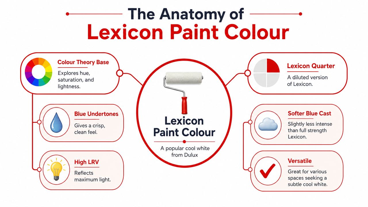
What gives Lexicon Quarter its look
The most useful reference point is Lexicon Quarter because it is often the version that works best in occupied homes, not just on a sample card. A 2024 Australian paint colour review of Dulux Lexicon Quarter describes it as a cool white with subtle blue-grey undertones and notes its LRV of 90. That aligns with how it behaves in practice. It reflects a lot of light, stays crisp, and avoids the creamy cast that can make a newer renovation feel softer than intended.
The technical side matters here, but only if it helps make better choices on site. Lexicon Quarter sits at the cleaner, brighter end of white, which is why it suits contemporary extensions, newer apartments, and updated Californian bungalows where the brief is a sharper finish rather than warmth.
Here is what that translates to in practical terms:
- High reflectance: it throws light back into the room and helps walls read brighter.
- Cool base: it holds a fresher, more architectural look than warmer whites.
- Fine tinting: it still has enough softness to avoid looking sterile in the right setting.
If you're weighing white paint against flooring, upholstery, and timber tones at the same time, Critelli Furniture's paint guide is a useful companion read because it treats colour as part of the whole room rather than an isolated wall decision.
Why those traits matter on site
Lexicon Quarter is unforgiving in one specific way. It makes quality visible.
On a sound surface with clean cutting-in and even roller work, that is a strength. In an older Melbourne home with patchy plaster, past repairs, or trim that has been painted over too many times, the same clarity can expose every defect. I see this regularly in period homes where clients want a fresh white trim package but the substrate was built for enamels and softer off-whites, not a crisp modern finish.
That is why Lexicon Quarter usually performs best in these applications:
- Open-plan living areas where extra reflected light helps carry brightness deeper into the home
- Skirtings, doors, and architraves where a sharper white creates definition
- Minimal interiors with stone, brushed metals, pale oak, or black fixtures
A white with this level of reflectance shows workmanship, substrate quality, and sheen choice more clearly than homeowners often anticipate.
The undertone is the second part of the equation. Lexicon feels fresh because of that cool blue-grey bias, but the same undertone can turn hard under warm LED lamps, against yellow-beige flooring, or beside older varnished timber. In Melbourne housing stock, that trade-off matters. A bright townhouse renovation can carry it easily. A south-facing Edwardian sitting room with amber downlights often needs more restraint.
How Lexicon Performs in Melbourne Lighting
A colour card for Lexicon can look straightforward in the showroom. Put that same white into a Brunswick terrace, a South Yarra apartment, and a new build in Doncaster, and it reads three different ways. Melbourne light does that, and Lexicon is clear enough to show every shift.
Lexicon Quarter reflects a lot of light, so orientation matters more than it does with softer whites. In rooms with balanced daylight, it reads crisp and tidy. In rooms that are already cool, shaded, or full of grey finishes, it can start to feel sharper than the sample suggested. That is why I treat Lexicon as a site-specific white, not a default white.
North-facing and west-facing rooms
North-facing spaces usually give Lexicon the cleanest result. In Melbourne homes with good natural light, especially renovated Federation and Californian Bungalow living areas, it tends to stay bright without looking sterile. The undertone sits back because the room already has enough light to carry the colour properly.
West-facing rooms need a more careful read. They often look balanced through the middle of the day, then warm up noticeably in the afternoon as sun hits timber floors, window furnishings, and joinery. That shift can help Lexicon. In some homes it takes the edge off and gives the white a more settled look by evening.
On site, these settings usually hold up best:
- Walls in low-sheen for washability without excessive surface glare
- Trim in semi-gloss or gloss where you want sharper lines and better durability
- Large sample boards moved around the room because one fixed test patch rarely tells the full story
For clients comparing options room by room, our guide to interior wall painting colours helps frame that decision around light, finish, and substrate condition rather than the colour chip alone.
South-facing rooms and artificial light
South-facing bedrooms, hallways, and shaded apartments are where Lexicon needs more discipline around the rest of the palette. In those spaces, the cool bias becomes more visible, especially with grey flooring, white laminate joinery, and black or chrome fixtures. The paint is not failing. It is accurately reflecting the room.
I see this regularly in Melbourne apartments where clients want a fresh architectural white but the available daylight is limited for most of the day. If the room already feels cool at 10am, Lexicon will usually reinforce that mood rather than soften it.
Materials matter here. Timber, textiles, and lamp temperature all matter more with this white than many homeowners account for.
If the room is cool in its natural light, cool in its hard finishes, and cool in its furnishings, Lexicon will intensify that overall effect.
Artificial lighting changes the result again. Warm LEDs can make Lexicon feel calmer at night and reduce the clinical edge. Cool LEDs do the opposite. They pull the grey-blue note forward and make the walls look harder after sunset, even when the same room felt fine in daylight.
The best test is still the one done on site. Paint a proper sample on the actual surface, then check it in the morning, mid-afternoon, and at night with the lamps on. Lexicon usually performs well in Melbourne homes when the room has enough warmth, texture, or daylight to balance its clarity. When those supports are missing, the colour choice needs to be more restrained.
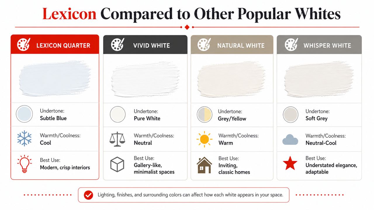
Lexicon Compared to Other Popular Whites
Lexicon Quarter sits in the crisp, cool end of the white range, and that's exactly why it suits some Melbourne interiors and misses in others.
There isn't much region-specific, evidence-based material comparing Lexicon variants and other near-whites under Melbourne daylight and mixed furnishing conditions, which is one reason selection errors are common. That gap is reflected in a Houzz Australia discussion about Lexicon Quarter and related strengths, where the need for practical comparison is obvious.
Where Lexicon Quarter sits in the white spectrum
Lexicon Quarter is for clients who want clarity. If the room is contemporary, the trims need definition, or the brief is “clean but not yellow”, it stays a strong candidate.
By contrast:
- Vivid White usually appeals to people chasing a sharper, gallery-like white.
- Natural White generally suits homes that need more softness and warmth.
- Whisper White often lands in the middle, where the client wants restraint rather than a hard cool edge.
Those distinctions matter most in Melbourne homes with mixed conditions. A weatherboard renovation might need one white for front rooms and another for the rear extension. An apartment with shadowed bedrooms might need a less assertive white on walls, then Lexicon Quarter only on trim.
For more examples of how whites are used across lived-in interiors, this guide to interior wall painting colours is useful because it places colour selection in practical residential settings rather than in isolated swatches.
Dulux White Comparison Lexicon Quarter vs Key Alternatives
| Paint Colour | Undertone | LRV (Approx.) | Best For |
|---|---|---|---|
| Lexicon Quarter | Subtle blue-grey, cool | 90 | Modern interiors, bright trims, ceilings, clean architectural finishes |
| Lexicon | Cool, bluish-white | 84 | Slightly softer cool result, façades, trims, walls where Quarter feels too sharp |
| Vivid White | Neutral to very crisp | Qualitatively very bright | Minimalist spaces that can handle a stronger white presence |
| Natural White | Warmer, softer | Qualitative only | Classic homes, warmer schemes, timber-heavy interiors |
| Whisper White | Neutral-cool to soft grey | Qualitative only | Flexible schemes needing less contrast than Lexicon Quarter |
The practical takeaway is simple. If you want a white that reads fresh and deliberate, Lexicon Quarter is often the better fit. If the room already feels cold or shadowed, another white may do the job with less risk.
Strategic Pairings and Interior Applications
Lexicon works best when it's used deliberately, not spread everywhere by default.
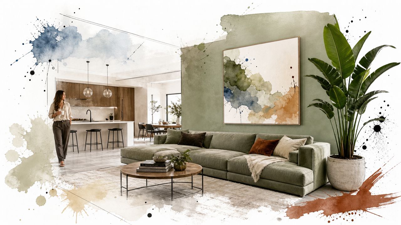
Where Lexicon works best
On walls, Lexicon paint colour tends to suit open-plan spaces with good natural light. In a renovated Edwardian in Camberwell, that usually means the rear kitchen, dining, and family zone rather than the darker original hallway and secondary bedrooms. In those brighter areas, it keeps the room looking intentional and tidy, especially around square-set finishes, contemporary joinery, and stone splashbacks.
On trim, it's even more versatile. Skirtings, architraves, doors, and ceilings often benefit from a cooler white because the contrast looks cleaner against coloured walls or natural timber floors.
Common applications that usually read well:
- Ceilings: Particularly where the aim is to keep the ceiling looking clear rather than creamy.
- Joinery and cabinetry: Works well in modern kitchens with darker benchtops or black fittings.
- Period details with restraint: In older homes, use it on selected trim elements if the wall colour carries a little more softness.
Good pairings don't come from the fan deck alone. They come from balancing white paint against flooring, benchtops, curtain fabric, and lamp temperature.
What to pair it with
Lexicon handles darker companion colours well. Deep charcoal, navy, muted green, and smoked timber finishes usually give it enough contrast to feel grounded. That's one reason it can work in a modern extension attached to a period home. The old part of the house can hold character, while the newer spaces feel sharper.
It also works with natural textures. Pale oak, limestone-look porcelain, wool carpet, and brushed metal finishes can take the edge off the cool undertone without turning the room yellow.
If the project is pre-sale, colour choices should also support presentation rather than fight it. There's practical crossover with advice on how to maximize your home's value with staging, because neutral paint only works properly when furniture layout, styling, and visual warmth are pulling in the same direction.
What usually doesn't work is pairing Lexicon with too many cold elements at once. Grey flooring, cool LEDs, blue-white stone, and black joinery can push the whole room into a hard finish that feels sterile rather than refined.
A Technical Guide to a Flawless Finish
A flawless Lexicon finish depends less on the colour name and more on the preparation, substrate condition, and sheen selection underneath it.
Sheen and substrate matter more than most people think
For most interior walls, a washable acrylic low-sheen is the practical choice. It gives enough durability for living areas and hallways without highlighting every patch and trowel mark the way a higher sheen can. On ceilings, a flatter finish is usually safer because it hides minor undulation and cuts down reflected glare. On trim and doors, a satin or semi-gloss enamel is usually the better system because those surfaces need more durability and a tighter-looking finish.
This matters more with Lexicon than with softer whites. Cleaner whites expose defects quickly. If the plaster repairs are patchy, if old water stains were never sealed properly, or if the sanding was rushed, the final coat won't hide it.
A proper sequence usually includes:
- Cleaning and decontamination: Dust, grease, and soap residue have to come off before any coating starts.
- Stopping and sanding: Holes, dents, old picture hook damage, and surface ridges need to be levelled properly.
- Spot priming or full priming where needed: Water marks, tannin bleed, repaired areas, and bare substrate need the correct primer.
- Two full finishing coats: That's what gives consistent opacity and an even sheen.
For readers who want a general primer on patching before repainting, Colorado Art Services' wall repair methods are a useful visual reference. The basic principle is the same on any professional paint job. The repair has to disappear before the white goes on.
A lot of finish problems are really sheen problems. This breakdown of paint finishes and where they work best is helpful because it shows why walls, ceilings, doors, and trim shouldn't all be painted in the same product.
Exterior use and the Lexicon vs Lexicon Quarter decision
On exteriors, the Lexicon decision is less about fashion and more about how the colour will sit on the elevation through Melbourne weather. Dulux Australia lists full Lexicon as Atlas SW1E3 with LRV 84, RGB 231/234/234, Hex #e7eaea, and Solar Absorptance 0.239 on the Dulux Lexicon specification page. Compared with Quarter, it reflects less light and absorbs more heat, so it tends to read slightly softer and less stark on façades.
That can be useful on weatherboards, render, and broad trim packages where Quarter might feel too bright. In bayside areas, where light can be hard and reflective, that softer read can look more settled over larger surfaces.
On exteriors, “whiter” isn't always better. A colour that feels crisp on a sample card can look overexposed across a full façade.
The technical side still decides the longevity. Exterior timber needs sound preparation. Render needs stability and the right coating system. Previous coatings need to be checked for adhesion before a fresh white goes over the top. Lexicon will reward good trade practice, but it won't compensate for shortcuts.
Ensuring a Perfect Lexicon Project in Melbourne
A successful Lexicon result comes down to matching the colour to the room, the light, and the surface. That's true whether you're painting a front lounge in Kew, a renovated apartment in Richmond, or exterior weatherboards in Brighton.
The main variables are always the same. Orientation changes the undertone. Existing finishes change how crisp the white feels. Architecture changes where contrast should sit. A white that looks perfect on trim may be too cold across full walls. A wall colour that looks balanced in daylight may fall apart under evening LEDs.
That's why on-site assessment matters more than online inspiration. You need to see the room, the flooring, the joinery, the previous paint system, and the condition of the substrate before making the final call. White paint is rarely difficult because it's white. It's difficult because every small variable becomes more visible.
If you want a second opinion before committing, a proper colour consultation in Melbourne is the right step. It lets the decision happen in the actual light, with the actual surfaces, rather than in abstract.
If you're weighing up Lexicon or Lexicon Quarter for your home, apartment, or pre-sale repaint, Newline Painting can inspect the space on site, talk through the trade-offs, and provide a free written quote. The team is Melbourne-based, has completed 500+ projects, uses recognised paint systems including Dulux, and backs workmanship with a 7-year warranty and $20M public liability insurance. Call 1300 044 206 to arrange a free on-site quote.