
You've probably done some version of this already. You stand in front of a wall of paint chips, hold up three whites that look identical in the store, then get home and realise one reads yellow, one looks grey, and one makes the room feel flat. That's usually the point where colour stops feeling fun and starts feeling expensive.
A proper colour consultation melbourne service solves that problem by narrowing choices to what works in your home, with your light, your flooring, your joinery, and your reason for painting. For some people that means getting an interior repaint right the first time. For others it means choosing safe, broad-appeal colours before listing a property for sale. Either way, the goal isn't to chase trends. It's to make better painting decisions before the first litre is opened.
Table of Contents
- Choosing Paint Colours A Guide to Professional Help
- What a Professional Colour Consultation Involves
- Key Benefits for Melbourne Homeowners and Sellers
- Melbourne-Specific Colour Considerations
- The Newline Painting Colour Consultation Process
- Cost Value and How to Prepare for Your Consultation
- Colour Consultation FAQs
Choosing Paint Colours A Guide to Professional Help
Most paint mistakes don't happen because people have bad taste. They happen because colour is hard to judge in isolation. A swatch on a retail wall doesn't show what happens when that same colour sits next to oak floors, stone benchtops, warm LED globes, white trim, and afternoon sun hitting one side of the room.
That's why a professional consultation helps. It gives you a structured way to choose colours based on the actual room rather than guesswork. In Melbourne, that matters even more because homes vary so much. Apartments, weatherboards, renovated terraces, and new builds all carry different light conditions and fixed finishes.

A colour consultation for a painting project usually answers a few practical questions:
- Which colours suit the space: Not just what looks good on a card, but what sits properly with floors, cabinetry, tiles, and furniture.
- Which colours are risky: Some shades turn green, blue, pink, or muddy once they're spread across a full wall.
- Where should colour change: Open-plan homes often need continuity, while bedrooms, bathrooms, and feature walls can handle more variation.
- What finish should go where: Sheen affects how colour reads and how walls wear over time.
Practical rule: If you're comparing ten similar neutrals and still can't explain the difference between them in your room, you don't need more swatches. You need a better selection process.
A good consultation also saves time during quoting and scheduling because the scope becomes clearer. Painters can plan primer requirements, likely coverage issues, feature wall transitions, and the right sequence for interior painting or pre-sale work.
If you want a broader starting point before booking samples, this Melbourne homeowner's guide to choosing the perfect colour palette is a useful companion. It helps you sort personal preference from practical constraints, which is where most strong repaint decisions begin.
What a Professional Colour Consultation Involves
A lot of people assume a colour consultation is someone arriving, pointing at a fan deck, and saying “that one looks nice”. That isn't how a proper process works. In Melbourne, the market has become far more structured. Providers now offer in-person and online services, with repeatable methods such as draping and personalised palette guide books, which reflects a mature local service category for homeowners according to colour analysis providers operating in Melbourne.
It's a technical review of the room
The job is to assess how a colour will behave once it's on your walls. That means looking at:
- Natural light: Morning light, afternoon light, and how much direct sun the room gets
- Orientation: North- and south-facing rooms don't read colour the same way
- Undertones: Flooring, benchtops, splashbacks, curtains, brick, stone, and timber all push colours warmer or cooler
- Value and intensity: How light or dark a colour is, and whether it feels muted or crisp
- Use of the room: A hallway, rental apartment, family kitchen, and formal living room don't need the same approach
This is why a neutral isn't automatically safe. Some whites feel creamy beside cool tiles. Some greys go lilac next to timber. Some beiges flatten a room that already lacks natural light.
It's about cohesion not single colours
The strongest consultations don't just pick one wall colour. They build a scheme. That includes ceiling colour, trim colour, doors, cabinetry, and sometimes exterior elements if the project crosses multiple surfaces.
For interior work, that often means making sure the home flows from room to room rather than looking like each space was chosen in isolation. For compact units, it can also mean simplifying the palette so the home feels calmer and more connected. If you're planning a repaint, seeing how that process fits into the broader job helps. The Newline Painting process overview is useful for understanding how colour decisions connect to quoting, preparation, and final application.
Good colour advice removes options as much as it adds them. The point is to cut out colours that will fight the room.
It should reflect the way you live
A consultant should also ask questions a colour chart never can. Do you have kids marking hallway walls. Is the apartment a rental turnaround. Are you repainting to sell. Are you keeping dark furniture. Do you want low-sheen washable walls or a softer finish in bedrooms.
That's where colour choice starts overlapping with practical painting decisions. A home that needs interior painting has different priorities from an apartment painting project where light, wear, and compact rooms change the brief.
Key Benefits for Melbourne Homeowners and Sellers
A professional consultation is most useful when the painting decision has consequences. Living with the wrong colour for years is frustrating. Selling with a paint scheme that narrows buyer appeal is costly in a different way.

Benefits for homeowners
For owner-occupiers, the biggest gain is usually confidence. Once the colours are tied to the room's actual conditions, decisions get easier. You stop second-guessing every sample and start focusing on what will feel right day to day.
That matters most in these situations:
- Open-plan interiors: Colour needs to connect kitchen, dining, living, and hallway areas without becoming monotonous.
- Renovated homes with mixed finishes: Old timber, new stone, older tiles, and replacement joinery often bring competing undertones.
- Rooms you use constantly: Bedrooms, living rooms, kitchens, and hallways are where bad colour choices wear on you fastest.
A proper consultation also helps avoid rework. Repainting because a colour looked right in the shop but wrong at home means paying twice in time, materials, and disruption. In practical terms, a better decision up front usually matters more than adding another sample card to the pile.
Benefits for property sellers
Sellers are working to a different brief. The question isn't “what's my favourite colour?” It's “what helps this property present cleanly, consistently, and broadly enough for the market?”
That's especially relevant in Melbourne. A key local issue is whether a consultation is worth paying for instead of defaulting to market-safe neutrals. The available source material notes that Melbourne is a price-sensitive market and that renovation demand in Victoria remains high, which makes presentation choices more important. It also notes that a consultation helps bridge personal taste and broad market appeal for pre-sale painting decisions, based on this Melbourne property presentation discussion.
For pre-sale work, the best colour isn't always the most stylish one. It's the one that makes the home feel cleaner, brighter, and easier for buyers to understand.
That often means colours that do three things well:
| Situation | What usually works | What often doesn't |
|---|---|---|
| Small rooms | Soft, light, stable neutrals that don't swing too yellow or blue | Heavy dark tones that absorb light |
| Mixed-condition homes | Consistent wall colour through key living areas | Too many room-by-room changes |
| Older homes before sale | Colours that freshen tired surfaces and reduce visual noise | Strong personal colours that divide buyers |
A repaint also works best when it sits alongside the rest of the presentation plan. After painting, a proper clean makes a visible difference to windows, bathrooms, kitchens, and floors. If you're coordinating the whole pre-sale process, these insights from Calibre Cleaning are worth reading because cleaning and painting usually do their best work together.
For projects with sale timing attached, pre-sale house painting becomes less about decoration and more about sequencing. Colour choice, preparation, final touch-ups, and the handover date all need to line up.
Here's a quick video that helps visualise the impact of a well-planned repaint in a lived-in home:
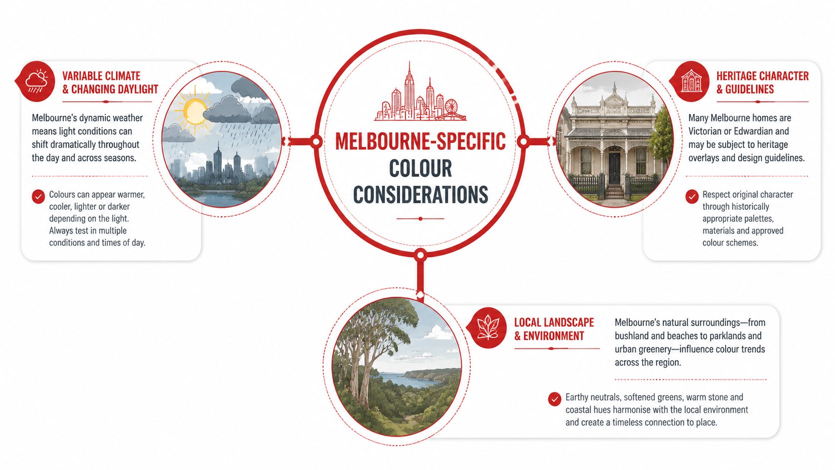
Melbourne-Specific Colour Considerations
A colour that looks balanced in a showroom can fall apart in a Melbourne home by mid-afternoon. I see it often with pre-sale repaints. Owners choose a safe grey or warm white, then the room reads flat, yellow, or cold once it is up on the wall and sitting against the home's fixed finishes.
Light shifts colour faster than people expect
Melbourne light changes hard across the day, and that affects sale presentation as much as day-to-day living. A front room can look crisp in morning light, then pick up a completely different cast later on. That matters if the house is being photographed for a campaign, opened for inspections, or painted to freshen tired interiors without replacing every surface.
The practical checks are straightforward:
- South-facing rooms can make cool neutrals feel lifeless, especially in older homes with darker floors or heavy trim.
- North-facing rooms push warmth forward, so off-whites and greiges need tighter control or they can turn creamier than intended.
- Low-light areas such as hallways, laundries, and some apartment living zones need colours that stay clean without looking stark.
The point is not to chase a trend. The point is to choose colours that hold together from wall to wall and from inspection photos to the in-person walk-through.
Melbourne homes do not share the same colour brief
Property type changes the job. A Docklands or Southbank apartment often needs paint colours that make the space feel larger, stay consistent under artificial light, and present well in listing images. By contrast, a Victorian or Federation home usually has more transitions to resolve, including arches, ceiling lines, fireplaces, decorative trim, and older timber elements that already set the tone.
That difference affects resale outcomes. Apartments usually benefit from tighter colour continuity because too many shifts make compact spaces feel chopped up. Period homes often need a more selective approach so the repaint freshens the interior without stripping out the character buyers expect.
If digital presentation is part of the plan, compare paint choices with virtual styling and layout tools before the work starts. Roomstage AI's Melbourne solutions show how online presentation can support decisions about colour, furniture placement, and how the property will read in marketing images.
Exterior colours have to survive Melbourne conditions
Exterior colour selection is less forgiving. The same shade can read calm on render, too sharp on weatherboards, and completely different again beside red brick or a faded tile roof. Add Melbourne's changing weather, tree cover, road dust, and moisture exposure, and maintenance becomes part of the colour decision.
For exterior work, I usually check four things first:
- Street context. The house needs to sit comfortably with neighbouring properties, fencing, roofing, and established gardens.
- Fixed materials. Brickwork, stone, gutters, paving, and roof colours stay visible, so the paint has to work with them.
- Wear pattern. Some colours show dirt, oxidisation, and patching sooner, which matters if the goal is a clean finish that still looks good months later.
- Planning limits. Heritage controls and neighbourhood character overlays can narrow the sensible colour range.
Exterior advice also needs to line up with preparation and product choice. exterior house painting should be planned alongside colour selection, because substrate condition, sheen, and exposure all affect how the final result looks from the street.
The Newline Painting Colour Consultation Process
A colour consultation works best when it is tied to the painting job from the start. In Melbourne homes, the right process saves repainting, reduces hesitation, and helps the finished work hold its value whether the property is for living in, renting out, or preparing for sale.

Step one starts with the room not the colour chart
The first useful conversation happens on site. A fan deck on its own will not tell you how a colour will sit against old floorboards, a cream tile splashback, or a west-facing living room that heats up visually in the afternoon.
The starting point is the room itself. That means checking what is being painted, what stays as is, what light the space gets, and what the job needs to achieve. A family home being updated for another ten years calls for different decisions from a rental refresh or a pre-sale repaint where broad buyer appeal matters more than personal preference.
I also look at the scope early. If walls are tired, trims are yellowed, or ceilings are dragging the room down, the consultation has to reflect that. There is no value picking a good wall colour if the rest of the surface package will make it read dirty, flat, or mismatched.
Shortlisting colours and sheen levels
Once the room is assessed properly, the options narrow fast. That is where practical painting experience matters, because colour choice and finish choice affect each other.
Typical recommendations cover:
- Wall colour direction that suits the room size, light level, and intended use.
- Trim and ceiling relationship, especially in homes with ornate details, older timber, or newer square-set finishes.
- Sheen selection based on washability, wall condition, and how much reflection the room can handle.
- Feature decisions for studies, joinery, entry walls, or other areas where contrast needs to be deliberate.
Sheen is often where DIY selections come unstuck. A colour can look right on a sample chip and wrong across a full wall if the finish throws too much light or highlights patching and sanding marks. In pre-sale work, this matters because buyers notice surfaces before they name colours. Clean, even presentation usually does more for the result than a risky statement shade.
Newline Painting includes free colour consultation as part of booked painting projects, which means the advice is tied to the scope of work, the existing surfaces, and the finish required on site.
The right sheen helps a good colour stay clean-looking, consistent, and easier to maintain.
Testing before full application
Final selection should be tested in the space before full application. Small printed samples are useful for direction, but they are not enough to sign off a whole room or exterior frontage.
Testing can include sample pots, larger brush-outs, or placing colour on more than one wall. That gives a clearer read across morning light, afternoon shadow, and evening artificial light. It also shows whether the colour stays balanced next to fixed materials that are not being changed.
Before sign-off, a few practical questions need clear answers:
- Does the colour still read well across the day
- Does it sit comfortably with tile, stone, carpet, timber, or brick
- Will it hold up across a full wall or open-plan area
- Does the chosen finish suit the level of preparation and the condition of the substrate
That process keeps the job tighter from start to finish. It reduces mid-project changes, helps the painting schedule run cleanly, and gives Melbourne homeowners a result that looks right in person and presents well if the property is heading to market.
Cost Value and How to Prepare for Your Consultation
Individuals considering colour consultation melbourne typically seek quick answers to two things. Is it worth paying for, and how do I avoid wasting the session once it's booked.
Why the value matters more than the fee
The hard part isn't usually finding colour advice. It's finding advice that's useful for your property type, your light, and your project. Source material around Melbourne consultations points out that homeowners often want to know what's included, how long the process takes, and whether remote or AI-led advice can account properly for local daylight and different housing types. It also highlights that these questions are especially relevant in Melbourne's varied housing market, as noted in this overview of cost and accessibility questions around colour advice.
That's the true benchmark. Not just “what does it cost,” but “what decision does it help me make?”
A consultation usually has stronger value when:
- You're painting multiple rooms: Consistency matters more once colour transitions start affecting the whole home.
- Your fixed finishes are hard to match: Timber, tiles, benchtops, and brick can make DIY colour selection unreliable.
- The painting budget is meaningful: The larger the job, the less sense it makes to guess.
- The property is going on the market: Presentation decisions affect the whole campaign.
If you're only patching one wall or repainting a spare room in the same existing colour, detailed advice may be unnecessary. If you're repainting an entire interior, exterior, or apartment before sale, it usually makes far more sense.
How to prepare so the advice is actually useful
You'll get better recommendations if you do a little homework first. Not design-school homework. Just practical preparation.
Bring or note the following:
- Photos of the rooms: Include the darkest corner, the main wall, and any adjoining spaces.
- Your fixed surfaces: Flooring, tiles, benchtops, splashbacks, brick, roofing, and cabinetry matter more than loose décor.
- A short mood brief: Calm, warm, crisp, soft, clean, moody, rental-safe, or sale-ready are all useful directions.
- Inspiration references: Saved images help, even if the final recommendation goes in a different direction.
- What's not changing: Furniture, rugs, curtains, artwork, and timber furniture often anchor the palette.
- Your practical constraints: Kids, pets, rental wear, timeframes, and whether the property will be occupied during painting.
Bring examples of colours you dislike as well. Ruling out creamy whites, cool greys, or dark trims often speeds the decision more than listing favourites.
If the consultation is remote, take photos in natural daylight and avoid heavy filters. If it's on site, make sure access is available to the rooms being discussed, including outdoor areas if the exterior is part of the project.
Colour Consultation FAQs
How long does a colour consultation take
The timeframe depends on how many surfaces need decisions and how risky the choice is. A single bedroom with straightforward light is faster than a full-home repaint or a pre-sale job where the colour scheme needs broad buyer appeal. The goal is to leave with clear decisions, not a rushed shortlist that creates delays once painting starts.
What if I don't like the suggested colours
That is part of the process. A good consultant explains why certain colours will work better with your flooring, cabinetry, brick, roofing, or natural light, then gives you options within that range.
I often find that clients are reacting to undertones rather than the colour family itself. Once that is identified, the decision gets easier. You keep control of the final choice. The consultation is there to reduce expensive mistakes and show the trade-offs before paint goes on the wall. For readers interested in the technical side, this summary of formal colour-analysis methodology outlines the underlying principles.
Can colour consultation help with exteriors and weatherboard homes
Yes. Exterior work is where poor colour choices are hardest to hide and most expensive to correct.
Melbourne exteriors need colours that sit properly with fixed elements such as roof tiles, gutters, paving, brick bases, fencing, and neighbouring homes. Weatherboards add another layer because the shadow lines and trim details increase contrast. A colour that looks balanced on a rendered facade can read too sharp or busy on weatherboard if the body, trim, and feature colours are not handled carefully. That matters even more before sale, where the aim is to present the home as well-kept and broadly appealing rather than overly personalised.
Is online colour advice enough for Melbourne homes
Sometimes it is enough for a simple refresh. It is less reliable where the light changes heavily through the day, the home has mixed finishes, or several connected rooms need to read consistently.
Photos can flatten warmth, hide undertones, and miss how a white shifts from front room to hallway to rear living area. For apartments, period homes, and pre-sale repaints, on-site advice usually gives a better result because the recommendations are based on the property as it stands, not a filtered image on a phone.
If you're planning an interior repaint, apartment refresh, exterior update, or pre-sale painting project, Newline Painting can help sort colours before the job starts. Bring questions about light, sheen, and fixed finishes, and get advice tied to the painting work itself.