
You're probably looking at a room that should feel calm, but doesn't. A South Yarra apartment with clean lines can still feel flat by mid-afternoon. A Victorian terrace in Richmond can feel dim, closed-in and visually heavy, even after a recent repaint. A bayside home in Brighton can have great light, but the finish still feels cold because the colours, sheen and surfaces aren't working with that light.
That's where biophilic interior design becomes useful. Not as a styling buzzword, but as a practical way to make a Melbourne home feel more grounded, lighter and easier to live in through paint, texture, finish selection and better use of daylight. In painting terms, it means choosing colours and materials that support natural light, soften glare, work with timber and stone, and still hold up under real use.
In occupied homes, the difference usually comes down to execution. A biophilic scheme fails when the wall colour is right but the sheen is too reflective, the bathroom paint can't handle moisture, or a beautiful limewash finish is specified for a hallway that needs scrubbing. It works when the finish matches the room, the substrate is prepared properly, and the palette fits the architecture.
That practical layer matters in Melbourne housing. Narrow terraces, Federation homes with detailed trims, contemporary apartments with large glazing, and family homes exposed to seasonal moisture all need slightly different paint decisions. If you're refining palette direction first, these ideas on interior wall painting colours are a useful place to start. For the greenery side of the room, Leaves & Soul on interior plant styling offers good visual guidance on how plants can sit within a more considered interior rather than feeling like an afterthought.
Across 500+ projects completed, the pattern is consistent. The most convincing natural interiors don't rely on plants alone. They rely on good surface preparation, disciplined colour restraint, and finishes that still look right after daily life has had a go at them.
Table of Contents
- Bringing the Outside In with Biophilic Design
- What Is Biophilic Design and Why It Matters
- Biophilic Strategies for Melbourne's Architecture
- Choosing Paints and Finishes for a Healthy Home
- Real-World Examples in Melbourne Homes
- Working with Your Painter on a Biophilic Project
- Your Biophilic Repaint Checklist
Bringing the Outside In with Biophilic Design
Biophilic interior design works best when it's treated as a finish strategy, not just a decorating theme. In a Melbourne home, that usually means using paint and texture to make daylight travel better, reduce visual harshness, and support a stronger connection to natural materials already in the room.
A lot of interiors already have the bones for it. The room may have timber floors, a garden outlook, leadlight, stone benchtops or good morning light. The problem is often that the wall colour fights those features, or the sheen level throws glare back into the room and flattens everything else. A hard white on every surface can make a period home feel sterile. An over-saturated green can make a compact bedroom feel boxed in.
Good biophilic work starts with restraint. Softer greens, clay neutrals, muted sand tones, chalky off-whites and mineral blues tend to sit better in Melbourne light than anything too sharp or synthetic. The finish matters just as much as the colour. Low-sheen acrylics usually create a calmer read across broad walls because they diffuse light instead of bouncing it back aggressively.
Practical rule: If the room already has one strong natural feature, such as garden outlook, exposed timber or textured stone, let the paint support it rather than compete with it.
The painter's role in this style is more technical than commonly anticipated. Surface flatness, patching quality, sealer choice, stain blocking and correct topcoat selection all affect whether the final result feels quiet and natural or messy and overworked. A colour that looks excellent on a sample card can look wrong on a patched wall with side light if the prep hasn't been done properly.
That's why the best biophilic interiors usually feel understated. You notice how the room sits during the day. You notice that the walls don't glare, the colours hold together, and the finish still looks clean months later.
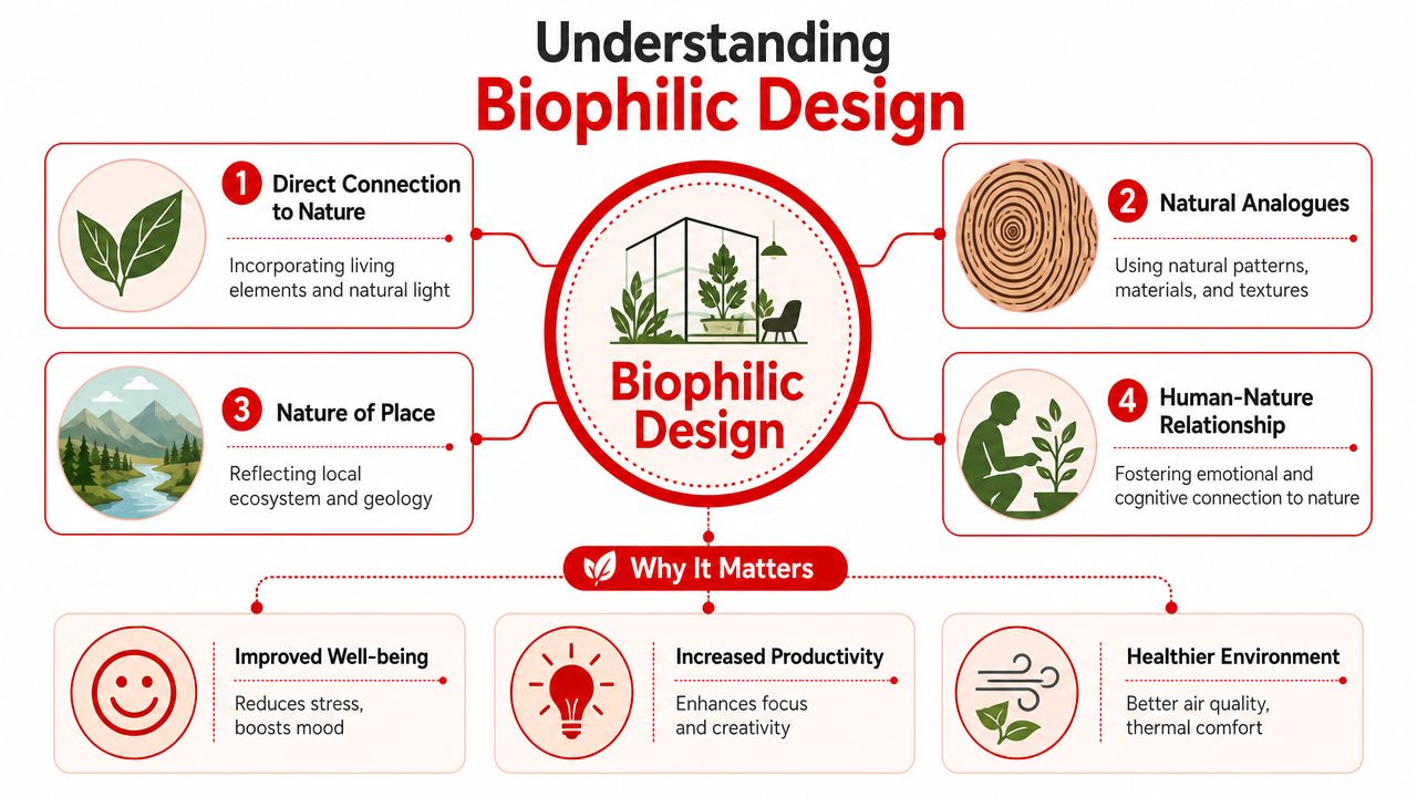
What Is Biophilic Design and Why It Matters
Biophilic design is the practice of building a stronger relationship between the interior and the natural world through light, planting, material cues and spatial feel. In homes, that means more than adding a fiddle leaf fig to a corner. It's about how the room handles light, what colours the surfaces reflect, how enclosed or open a space feels, and whether the materials read as warm and grounded or synthetic and hard.
More than plants and timber
There are a few layers to it.
One is the direct presence of nature, such as natural light, greenery and sometimes water. Another is indirect reference, including timber tones, stone, mineral colours and finishes with a softer, less manufactured look. The third is spatial response. Rooms feel better when there's a balance between openness and shelter, which is why alcoves, window seats, reading corners and lower visual zones often feel calming.
Terrapin Bright Green's guidance is useful here because it treats comfort as something designed, not accidental. It recommends using thermal and airflow variability through materials, daylighting, ventilation and fenestration, and notes that indoor refuge can be created with lowered ceiling conditions of approximately 18–24 inches below the main ceiling using soffits, drop ceilings, acoustical panels or suspended fabric, as outlined in the 14 Patterns of Biophilic Design. In practical terms, that matters in open-plan Melbourne homes where a whole room doesn't need to be visually open all the time.
Why clients are asking for it now
Interest in this style isn't limited to commercial fit-outs. Search demand has widened into residential interiors, with searches for “biophilic architecture” increased 150% and “biophilic design bedroom” increased 100%, according to the National Association of Realtors article on home design and biophilic design. That lines up with what many Melbourne homeowners are already prioritising. They want rooms that feel quieter, healthier and less visually synthetic.
For agents and vendors, this has another advantage. A natural palette generally photographs well, works across different furniture styles, and makes a property feel more liveable without looking heavily themed. For owner-occupiers, it's usually less about trend and more about how the room behaves at 8 am, 3 pm and 8 pm.
If planting is part of the brief, air-purifying office plants is a practical reference for species selection, especially where the interior needs greenery that can cope with ordinary indoor conditions rather than ideal studio light.
- Direct nature cues support the concept most obviously, but they don't carry the room on their own.
- Natural analogues often do the heavy lifting in painting projects, especially colour, texture and finish.
- Prospect and refuge matter in layout and visual zoning. A room can feel restorative without being filled with objects.
A strong biophilic room usually feels settled before a single plant goes in.
Biophilic Strategies for Melbourne's Architecture
Biophilic interior design only works when it respects the building type. The same paint palette won't behave the same way in an Albert Park terrace, a Kew Federation home and a new apartment in South Yarra. Light direction, ceiling height, timber detail and moisture load all change the finish strategy.
Victorian terraces and narrow plans
Terraces in Richmond, Albert Park and similar inner suburbs often need help carrying light deeper into the floorplan. In these homes, broad walls usually benefit from soft low-sheen finishes in warm off-whites, pale mineral greys or muted eucalypt tones rather than bright cool whites. Cool whites can make a narrow hallway feel sharper and flatter, especially where side light picks up every patch and roller mark.
The practical move is to keep reflectance gentle. A washable low-sheen acrylic on walls, a flatter ceiling finish to reduce glare, and cleaner whitework on skirtings and architraves usually creates enough contrast without breaking the calm. If the home has original fireplaces, dark floors or stained timber doors, softer wall colours stop those elements from feeling visually isolated.
Common painter's notes for this housing type include:
- Patch for side light: Old plaster and settlement cracks need careful filling, sanding and spot priming because narrow homes often reveal surface defects late in the day.
- Reduce sheen jump: Don't make walls too glossy if the corridor is already short on softness.
- Respect trim detail: Where original timberwork remains, choose wall colours that complement it instead of trying to overpower it.
Federation and Edwardian homes
Homes in Kew, Malvern and Hawthorn often already contain biophilic cues. There may be warm timber architraves, leadlight, decorative cornices and fireplaces. The painter's job is to connect those existing features, not erase them with generic white.
Earth-based greens, ochres, clay neutrals and softer mushroom tones often sit well here because they support period timber and filtered light. In heritage-capable work, paint selection also needs to account for substrate movement, previous coatings and moisture history. Older walls can be less forgiving, particularly where there have been past repairs, chimney staining or earlier enamel systems on trim.
The best period-house palette usually looks like it belongs to the building, not like it was imported from a display suite.
A breathable approach can matter in older fabric, especially on repaired plaster. That doesn't mean using novelty products everywhere. It means matching primer, undercoat and topcoat to the substrate, then choosing a finish that lets the room feel natural without compromising washability.
Contemporary homes and apartments
Newer homes in Camberwell or apartments in South Yarra have a different issue. They often have plenty of glazing, but the light can be hard rather than gentle. In these spaces, biophilic painting often means taking the edge off bright, reflective interiors.
That's where refuge becomes useful as a visual tool. A study nook, bedroom wall, reading corner or dining recess can take a deeper green, soft olive or stone-based neutral to create containment. In open-plan areas, this works especially well when paired with a quieter ceiling and less reflective surrounding walls.
A simple comparison helps.
| Home type | What usually works | What often fails |
|---|---|---|
| Victorian terrace | Warm low-sheen walls, restrained trim contrast, careful plaster prep | Stark whites, high sheen, heavy feature walls in narrow rooms |
| Federation home | Natural earth palette, trim integration, breathable thinking on older surfaces | Flattening all detail with one hard white |
| Contemporary apartment | Controlled contrast, refuge zones, anti-glare sheens | Overly glossy walls, cold greys, feature colours with no material connection |
Bayside homes add another layer. In Brighton or St Kilda, strong natural light can bleach out weak colour choices and make cheap flat paints look tired quickly. Indoors, that means selecting finishes with enough body and washability to handle a bright environment without chalky wear on high-touch walls.
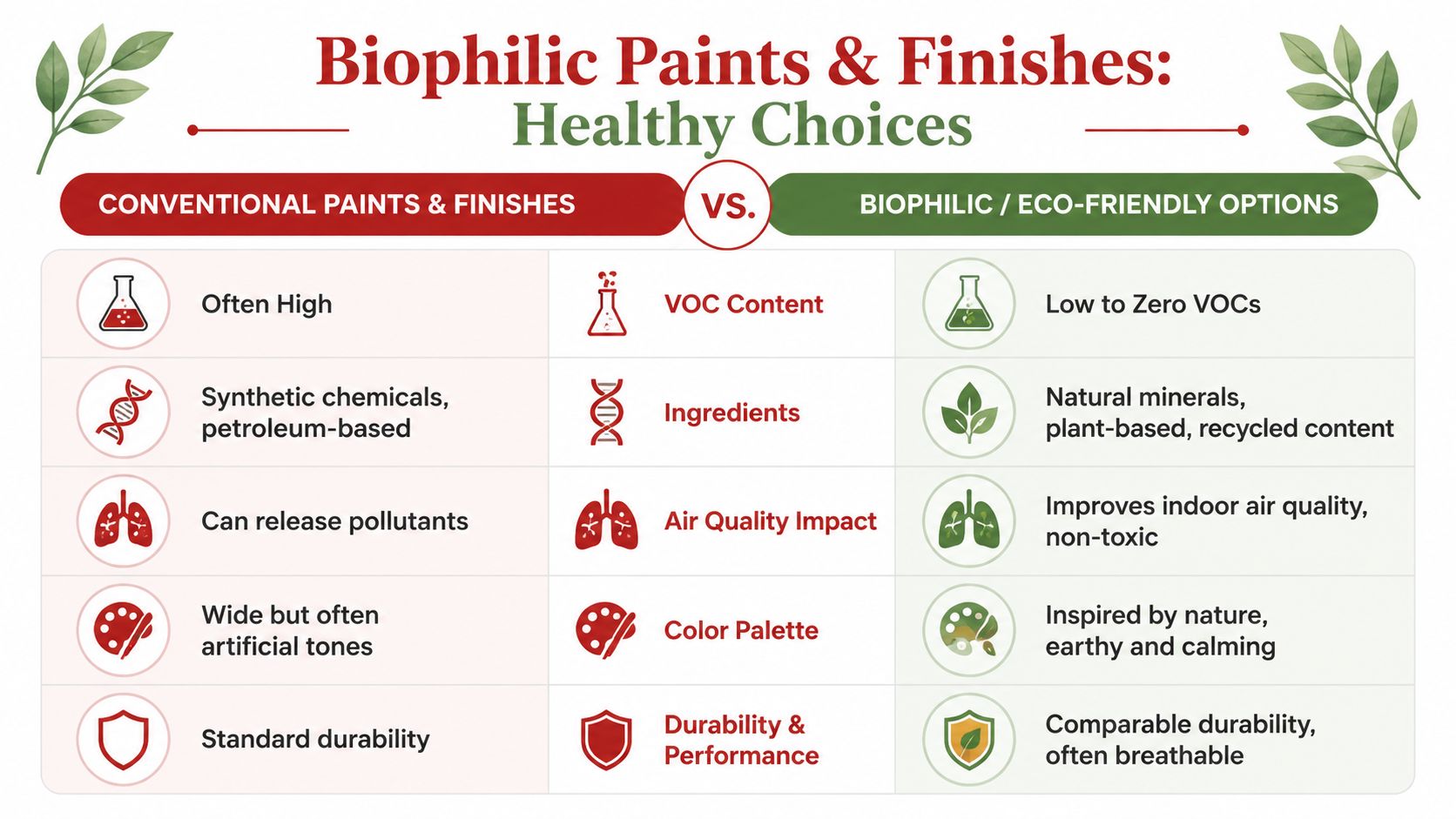
Choosing Paints and Finishes for a Healthy Home
A durable biophilic result comes from pairing the right colour idea with the right paint system. The aesthetic might be soft and natural, but the specification still needs to be disciplined. If the product doesn't match the room, the finish will fail long before the design does.
Colour and sheen do most of the work
Most biophilic interiors rely on a quiet palette. In practice, that often means soft green-grey, warm sand, clay beige, muted blue-grey, chalky olive or off-whites with a natural undertone. Dulux, Haymes, Taubmans, Berger and Wattyl all carry ranges that can support this direction. The exact colour matters less than the undertone and how it behaves in the room's natural light.
Sheen is just as important. Low-sheen acrylic is usually the safest all-round choice for living rooms, bedrooms and hallways because it gives some washability while still diffusing light nicely. Matte can look excellent in low-traffic rooms, but it needs a realistic maintenance conversation first. In family homes, hard-rubbing a very flat paint near switches, corners and bed heads often leaves visible burnishing.
The commercial side of biophilic thinking has also become more measurable. The WELL Building Standard's biophilia feature set requires plant beds and pots covering 1% of floor area and plant walls 2% of floor area, as noted in this overview of biophilic design and the WELL framework. That matters because it shifted the conversation from vague styling to specified outcomes. For residential painters, the takeaway is simpler. If the greenery and natural finishes are being treated seriously, the wall finish needs to be specified with the same discipline.
For homeowners weighing broader product choices, this guide to the benefits of eco-friendly paints for your Melbourne home is a useful companion when low-odour and lower-emission products are part of the brief.
A quick product logic check helps:
- Living areas: Acrylic low-sheen is usually the best balance of softness and maintenance.
- Bedrooms: Lower sheen levels often create the calmest result, especially with morning or western light.
- Wet areas: Use a system intended for moisture-prone rooms, not a decorative wall paint chosen only for colour.
- Trim and doors: Water-based enamel can suit many occupied homes where lower odour and reduced yellowing are priorities.
Paint systems that suit real rooms
Preparation still decides the outcome. On previously painted plaster, that may mean washing down, scraping unstable areas, filling, sanding, spot priming and then applying a full undercoat where required for porosity control or colour change. On water-damaged plaster, a stain-blocking primer is often the safer path before topcoats. On old timber trim, adhesion and tannin bleed need to be assessed properly before any enamel goes on.
Bathrooms and laundries are where biophilic ideals often run into reality. Natural colour is fine. Breathable-looking matte texture is often not. These rooms need products with moisture resistance and enough film integrity to cope with repeated humidity, cleaning and condensation. The same goes for busy hallways and family kitchens where hands, bags and chairs will hit the walls.
Here's a useful visual reference before choosing a finish system:
Site note: A healthy-feeling room isn't just about low-odour paint. It's also about sound prep, sensible ventilation during works, and choosing finishes you won't need to repaint prematurely.
Texture needs discipline
Limewash and similar mineral-style finishes can work beautifully in biophilic interiors because they create movement and a softer, more natural surface read. They're especially effective in bedrooms, sitting rooms and dining spaces where raking light can highlight the variation in a good way.
They are not universal. In corridors, kids' rooms, tight stairwells or humid bathrooms, highly textured decorative finishes can become a maintenance burden. They mark more easily, are harder to patch invisibly, and require more thought if future repairs are likely.
If the room includes furnishings with a similar ethos, this guide to eco-luxury furniture is a sensible reference point. Paint, furniture and textiles need to feel related. Otherwise the walls say one thing and the room says another.
Real-World Examples in Melbourne Homes
Biophilic interior design tends to succeed when the finish strategy solves a practical problem in the house. These examples reflect the kinds of decisions that make the style hold up in lived-in Melbourne properties.
Northcote weatherboard prepared for sale
The issue in this kind of home is often compression. Smaller rooms, older windows and mixed natural light can make the interior feel busier than it is. A restrained palette with warm, nature-based neutrals on walls and a cleaner trim colour can make the spaces feel more settled without stripping the house of character.
For pre-sale work, durability and presentation matter equally. The wall system needs enough washability to survive open-for-inspection traffic, but it also needs to photograph softly. In this setting, low-sheen acrylics generally outperform shinier systems because they reduce glare and make patched older walls look more even.
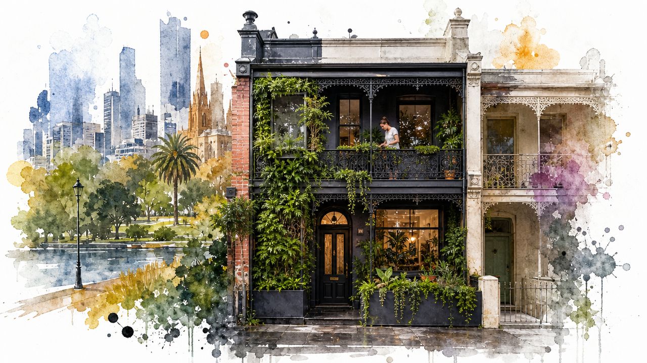
South Yarra apartment with a refuge zone
In a modern apartment, the problem is often the opposite. There's plenty of light, but not much visual relief. One way to solve that is to create a refuge area through colour blocking or a deeper, nature-linked wall colour in a study niche, bedroom wall or reading corner.
That kind of move works best when the rest of the apartment stays controlled. If every wall becomes a feature, the room loses the calm that biophilic work depends on. A single deep olive or mineral green can anchor the plan. The rest of the space can then stay lighter and more breathable.
Toorak heritage interior with breathable finishes
Older homes present a more technical brief. Decorative ideas have to be filtered through the condition of the substrate, previous coatings and maintenance risk. That's where many “wellness” interiors fall apart. They specify plants, natural materials and soft colours, but ignore the upkeep and failure points.
The practical trade-off is important. A key gap in many consumer discussions is the balance between wellness claims and maintenance, especially in humid bathrooms or high-use family spaces, as highlighted in this article on biophilic design and real-world maintenance considerations. In a heritage room, that can mean choosing a softer, more natural-looking finish that still allows for touch-ups, cleaning and movement in older plaster.
- What works: Natural colours that suit the building, proper patching, primers matched to substrate, and realistic sheen choices.
- What doesn't: Decorative finishes in hard-use zones without a maintenance plan.
- What clients usually appreciate later: A room that still looks right after winter condensation, family traffic and ordinary cleaning.
Working with Your Painter on a Biophilic Project
A good result depends on how clearly the brief is translated into a paint system. “Natural” isn't enough. Your painter needs to know what the room should feel like, how it's used, what light it gets, and how much maintenance you're willing to accept.
What to brief clearly
Start with function, not just colour. Tell the painter whether the room needs to feel softer, brighter, calmer, warmer or more enclosed. Mention if it gets harsh western light, poor ventilation, heavy family use or visible condensation in winter. Those details change both the colour call and the coating system.
Photos help, but samples inside the room matter more. Large test areas are worth doing where undertone is difficult, especially in homes with garden bounce light, dark timber or older cream trims that may be staying. If you need help narrowing options before painting starts, a professional colour consultation in Melbourne can save expensive second-guessing.
Don't brief a biophilic room as “green and earthy”. Brief it as “a low-glare bedroom that feels quieter in the evening and still cleans well around the bed head”.
What a proper quote should show
A serious painting quote should break out the preparation and the paint system. At minimum, it should identify what's being repaired, what's being primed, what products are going on walls, ceilings and trim, and how many coats are included. If the quote only gives a room name and a lump sum, it's too vague.
Look for practical detail such as:
- Surface preparation: Washing, scraping, gap filling, plaster repair, sanding, stain treatment and masking.
- Paint system: Primer, undercoat where needed, and nominated topcoat type for each surface.
- Occupied-home planning: Protection of floors and furnishings, staging, ventilation management and tidy handover.
- Aftercare clarity: What to expect during cure time, when to clean the walls, and how touch-ups will behave on the chosen finish.
This is also where accountability matters. Newline Painting, for example, backs workmanship with a 7-year workmanship warranty, carries $20M public liability insurance, and uses trade-qualified painters. Those aren't styling points. They matter when the brief includes specialist finishes, heritage surfaces or an occupied family home where shortcuts show up quickly.
Your Biophilic Repaint Checklist
A biophilic repaint works best when you make a few disciplined decisions before colours are locked in. Most problems start when the palette is chosen first and the room conditions are considered later.

Use this checklist to keep the project practical:
-
Define the room's job
Decide whether the space needs calm, softness, brightness, warmth or refuge. -
Assess the light properly
Check morning, afternoon and evening light before confirming colour. -
Read the architecture
Work with existing timber, cornices, ceiling height and window size rather than against them. -
Choose undertone before brand colour name
Natural palettes usually succeed because the undertones are restrained, not because the colours are fashionable. -
Pick sheen by use, not by sample card
Bedrooms, hallways and wet areas usually need different performance levels. -
Specify prep, primers and topcoats
Good patching and the right undercoat make natural finishes look intentional rather than uneven. -
Be realistic about maintenance
Limewash, matte finishes and textured surfaces need a room-by-room decision. -
Plan ventilation and access
Good airflow during painting and curing supports both finish quality and comfort.
A final practical note. If plants, textiles and furniture are part of the room update, keep the paint as the stabilising layer. It should hold the room together, not compete with every other natural element.
If you're planning a biophilic repaint in Melbourne and want a finish that looks calm, performs properly and suits the building, Newline Painting can help. Request a free on-site quote or call 1300 044 206 to talk through surface preparation, paint systems, colour direction and the right finish for your home.