You're probably looking at a fan deck, a few saved Instagram screenshots, and a room that doesn't behave the way the photos do. That's normal in Melbourne. A colour that looks soft and balanced in a bright display home can turn cold in a south-facing terrace in Albert Park, or look flat in an apartment during a run of grey winter days.
Interior wall painting colours work best when they're chosen for the room, the light, and the purpose of the property. In Melbourne, that often means making decisions with one eye on orientation and the other on presentation. If the home is owner-occupied, the scheme needs to feel right every day. If it's heading to market, it also needs to photograph well, read cleanly in person, and suit a broad buyer pool.
Table of Contents
- Colour Principles for Melbourne Homes
- Trending Palettes for Resale and Style
- Room-by-Room Colour and Sheen Guide
- How to Test Paint Colours Correctly
- Coordinating Trims, Doors, and Ceilings
- Common Pitfalls and Working with Professionals
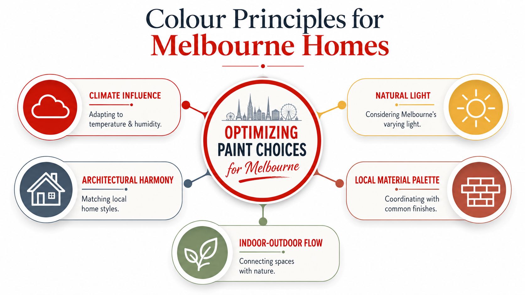
Colour Principles for Melbourne Homes
Colour choice in Melbourne is mostly about managing light well. That matters more than trend lists, especially in homes where orientation, window size, neighbouring buildings, and seasonal grey light all change how a wall reads through the day.
Start with light, not the colour chart
In Australia, daylight and sun angle vary by latitude and season, so a colour can shift noticeably depending on orientation. Guidance around north, south, east, and west light often stays too general, but in Melbourne that gap matters because winter light is very different from a bright summer afternoon, as noted in this Australia-specific discussion of daylight and sun angle.
A practical way to read a room is this:
- South-facing rooms usually need care with cool whites and flat greys. They can lose warmth quickly and start looking dull.
- North-facing rooms tend to handle more neutral and cooler shades because the light is steadier and kinder.
- East-facing rooms often look fresher in the morning, then quieter later in the day.
- West-facing rooms can push warm colours further than expected, especially in summer glare.
Practical rule: If a colour feels “just right” on a bright sample card, it often needs more testing before it goes on a Melbourne wall.
Read the undertone before you read the name
Paint names don't help much. The undertone does. A white can lean blue, yellow, red, green, or sit closer to neutral, and that undertone will show itself against fixed finishes like oak floors, benchtops, splashbacks, and stone fireplaces.
That's why the first thing to line up isn't your Pinterest board. It's the fixed finishes already in the room. In a Hawthorn Federation home with creamy cornices and warm timber flooring, a sharp cool white often looks disconnected. In a newer South Yarra apartment with polished concrete and black joinery, that same white can make sense.
If you're also balancing paint against tile selections, this kind of finish coordination matters just as much on vertical surfaces. A useful reference is Tiles Mate's wall tile guide, especially when you're trying to keep wall colour and hard finishes from fighting each other.
Match the room purpose to the colour weight
Room size changes colour perception. Darker colours close a room in. Pale colours bounce more available light. Neither is automatically right. It depends on what the room needs to do.
For everyday living spaces, lighter neutrals usually give you more flexibility with furniture, art, and future updates. For a study, snug, or bedroom, a deeper muted tone can work well if the room already has enough light and the rest of the scheme supports it.
A simple way to avoid a disconnected result is to choose one main direction and carry it through the home with controlled variation. This older guide on how to pick paint colours and use paint to fix a room's appearance is useful for that reason. It helps people stop treating each room as a separate decision and start reading the house as a whole.
Trending Palettes for Resale and Style
For resale, the safest interior wall painting colours in Melbourne are still warm whites, soft greiges, and restrained neutrals. They suit more buyers, they photograph cleanly, and they don't lock the next owner into someone else's taste.
Why neutrals keep winning
A 2025 home-staging report found that 98% of top agents agreed neutral colour schemes are the most popular with buyers, and that choosing one neutral paint direction lets a seller avoid a poor colour choice 99% of the time, according to the 2025 home-staging statistics sheet.
That aligns with what works on the ground. When a property is going to market, buyers usually respond better to a home that feels clean, flexible, and easy to move into. Strong personality colours can still look good, but they narrow the audience. In a softer selling environment, broad appeal matters.
This is why pre-sale repaints in Melbourne often start with whites, warm greiges, and soft stone-based neutrals rather than a long list of feature colours. They carry less visual risk.
What works across Melbourne property types
The palette should still suit the building. A Northcote weatherboard, a Kew Edwardian, and a contemporary apartment in South Yarra shouldn't all be painted the same way.
In practice, these families tend to hold up well:
- Warm whites for homes with period detail, timber floors, or softer natural light
- Greiges and putty neutrals for transitional interiors that sit between classic and modern
- Muted earthy tones for selected rooms where the home already has warmth in brick, timber, or stone
- Soft off-whites for apartments that need light bounce without the hardness of a stark white
The mistake is chasing “trend” without asking whether the room can support it. Melbourne's heritage housing stock often wants a more forgiving neutral than glossy magazine interiors suggest.
If you're updating a living zone without replacing major pieces, these budget living room refresh tips are a useful reminder that paint needs to work with sofas, rugs, and existing textiles, not against them.
Where to use colour without hurting broad appeal
You don't need to strip all character out of a home. You just need to control where colour sits. A muted study, powder room, or bedroom can carry more personality than a main open-plan area that has to appeal to everyone.
A good resale palette doesn't look timid. It looks deliberate, calm, and easy to furnish.
For owners who want some visual depth, the safer move is usually tonal variation rather than contrast for contrast's sake. Use a related deeper shade in a contained room. Keep the main circulation spaces lighter and more consistent.
This short video is useful if you're comparing current interior directions before settling on a final scheme.
Room-by-Room Colour and Sheen Guide
The right colour falls apart quickly if the sheen is wrong. In occupied homes, finish selection affects washability, defect visibility, touch-up behaviour, and how forgiving the walls stay over time.
Living areas and hallways
Living rooms, dining spaces, and corridors usually do best with acrylic low-sheen. It gives enough softness to hide minor substrate imperfections but still cleans better than a dead matt finish in busy areas.
For colour, stay with a stable neutral base unless the room has a clear reason to go deeper. Hallways in particular benefit from continuity. They connect the house, so they shouldn't jump around from room to room.
Bedrooms
Bedrooms can take more softness in both sheen and colour. If the light is reasonable, muted warm neutrals and toned-down earthy colours can work well here because the room doesn't need to perform the same way as the kitchen or main living zone.
A useful design rule is the 60-30-10 rule, where about 60% of the room is the dominant colour, usually the walls, 30% is the secondary colour, and 10% is the accent. Paint percentage formulas also help create lighter or darker versions of the same hue in 25% increments, as explained in this guide to the 60-30-10 rule and paint colour percentages.
That gives you a disciplined way to avoid over-colouring a room. If the wall colour is doing the heavy lifting, the rest of the room doesn't need to compete.
Kitchens and dining spaces
Kitchens need practicality first. Walls near cooking zones, walkways, and dining chairs should be durable and easy to wipe down. Low-sheen acrylic is still the standard choice in most cases, provided the substrate is sound and the prep is thorough.
Colour-wise, kitchens usually work better when they support the cabinetry, splashback, and benchtop instead of trying to become the focal point. If the joinery already has presence, the wall colour should settle the room.
Bathrooms and laundries
Wet areas need a paint system that matches the moisture load. Generic wall paint isn't enough in a bathroom that fogs up every morning. Prep is also more critical here because failed adhesion around old soap residue, hairline cracking, or patchy filler work shows up fast.
For colour, lighter tones usually keep bathrooms cleaner-looking and help smaller spaces feel less boxed in. Deep colours can work, but only if ventilation, substrate condition, and lighting all support it.
Paint Sheen Comparison and Best Use Cases
| Sheen Level | Characteristics | Best For |
|---|---|---|
| Matt | Soft look, shows marks more easily, can emphasise poor cleaning if used in hard-working spaces | Low-traffic bedrooms, ceilings where specified |
| Low-sheen | Balanced finish, practical, more washable, forgiving on typical plaster walls | Living rooms, hallways, dining areas, most interior walls |
| Semi-gloss | Harder finish, more reflective, highlights surface defects if prep is poor | Trims, doors, architraves, skirtings |
If you want to compare how these finishes behave before locking in a system, this guide to paint finishes and where to use them is worth reviewing.
How to Test Paint Colours Correctly
The best way to test paint colours is on movable sample boards, not little squares painted directly onto the wall. Small swatches lie, especially when the existing wall colour is influencing what you see.
Why wall swatches mislead people
A tiny patch doesn't show enough colour mass. It also sits on top of the old wall colour, beside the old wall colour, and often in just one part of the room. That's a poor test if you're trying to judge undertone, depth, or how the colour shifts from morning to evening.
Coverage is part of the problem too. Most interior wall paints cover roughly 120 to 150 square feet per litre per coat, and two coats usually give rich, even colour. Deep or bright colours may need an extra finish coat for proper hiding, according to this interior paint guide on coverage and coat expectations. If you judge a colour off one weak sample coat, you're not seeing the finish you'll live with.

A better way to sample
Use large boards or plasterboard offcuts. Paint each sample with two full coats. Then move them around.
A practical test process looks like this:
- Choose only a few contenders so you're comparing real options, not an entire fan deck.
- Paint large sample boards with the same sheen you expect to use on the wall.
- View them on different walls because orientation changes the reading.
- Check them during the day and at night under your actual lighting, not showroom lighting.
- Hold them against fixed finishes such as flooring, cabinetry, stone, curtain fabrics, and trims.
The colour isn't right until it still works on a dull day, at night, and beside the finishes that aren't changing.
In older Melbourne homes with patched plaster, previous gloss paint, or uneven repairs, this testing step matters even more. The wall condition can change how a colour presents once the full repaint goes on.
Coordinating Trims, Doors, and Ceilings
Trims, doors, and ceilings aren't secondary decisions. They're what make the wall colour look intentional instead of unfinished.
Why trim colour changes the whole room
Skirtings, architraves, doors, and cornices define the room perimeter. If they're too stark against the walls, the space can feel choppy. If they're too close in tone without purpose, the result can look muddy.
Most homes suit one of two approaches:
- Crisp contrast, where walls are neutral and trims are cleaner and lighter
- Tonal coordination, where trims sit within the same colour family for a softer, more architectural result
The right choice depends on the building. Period homes often carry more trim detail, so contrast can help that detailing read cleanly. Modern apartments usually suit a quieter tonal treatment because the lines are simpler.
What suits heritage homes and what suits modern apartments
In a Federation or Victorian house with ornate cornices, ceiling roses, and detailed architraves, the trim package deserves proper separation from the walls. That doesn't mean harsh white by default. It means enough distinction for the profile to read.
In a contemporary apartment in Richmond or South Yarra, matching or near-matching trims can make the room feel larger and less broken up. The cleaner the architecture, the more a tonal scheme tends to work.
A few practical rules help:
- Ceilings usually want restraint. If the wall colour is doing enough, the ceiling should settle the room.
- Doors carry more visual weight than skirtings. If you darken them, do it deliberately.
- Old enamel trims often need more prep than owners expect. Sanding, cleaning, spot priming, and adhesion planning matter as much as colour selection.
Inherit the logic of the house. Don't force a sharp contemporary trim treatment onto period detailing if the building wants softness.
The most successful schemes treat walls, trims, and ceilings as one system. That's what gives the finished repaint a professional look.
Common Pitfalls and Working with Professionals
Most colour mistakes don't come from bad taste. They come from testing badly, ignoring fixed finishes, or underestimating what certain colours demand on site.
Mistakes that cause expensive repaint decisions
The first mistake is choosing from a phone or laptop screen. Digital colour is useful for narrowing options, but it's not a decision-making tool. Screen brightness, photo editing, and ambient light distort everything.
The second is forgetting what can't be changed easily. Floors, stone, cabinetry, tiles, and even large rugs all influence what the wall colour will do. If those elements lean warm and the wall colour leans cold, the room will feel off even if the paint looked good in isolation.
The third is assuming every colour costs the same to apply. Professional guide specifications often cap schemes at five base colours plus three accent colours, with no more than eight colours across a project and no more than three in one area. The same specification warns that deep or high-contrast accent colours may require at least three finish coats over primer, and sometimes four, as outlined in this guide specification for interior painting colour limits and coat expectations.
That matters in real jobs. A bold feature wall isn't just “one extra colour”. It changes cutting-in time, masking, material use, and touch-up sensitivity.

What a proper painting quote should tell you
A serious interior quote should spell out more than the colour. It should tell you how the result will be achieved.
Look for these details:
- Surface preparation including cleaning, filling, sanding, caulking, and what happens with failed areas
- Paint system including primer where needed, wall finish, trim finish, and whether deep colours may need extra coats
- Scope boundaries so there's no confusion over ceilings, doors, wardrobes, or inside cupboards
- Timeline and access plan especially for occupied homes, apartments, and staged properties
- Protection and clean-up such as floor covering, furniture masking, and end-of-job handover
If the home has older plaster, water marks, smoke staining, or glossy enamel surfaces, the prep and priming notes matter even more. That's where a lot of shortcut quotes fall apart.
When to bring in a colour consultation
A colour consultation makes sense when the home has conflicting finishes, awkward light, or a resale objective that calls for restraint. It also helps in period homes where the trim package, ceiling height, and room sequence need a more considered approach than “same white everywhere”.
For owners who want professional input before painting starts, colour consultation in Melbourne is one option. In practice, the useful part of any consultation is not just picking a colour. It's narrowing the scheme, confirming how it works with the house, and reducing the chance of mid-project changes.
A painter should also be able to explain the trade-offs plainly. If a wall colour is likely to need extra coats, you should know before the quote is accepted. If a trim enamel will highlight poor substrate preparation, that should be said upfront too.
Newline Painting handles this with a written quote that details scope, preparation, paint system and timing. For Melbourne clients, that's backed by a 7-year workmanship warranty, $20M public liability insurance, and a trade-qualified team. Those details matter when the job includes heritage trims, occupied homes, or pre-sale deadlines where colour mistakes and delays both cost time.
If you want a second opinion on interior wall painting colours for your Melbourne home, apartment, or pre-sale project, request a free on-site quote from Newline Painting or call 1300 044 206.